-
Notifications
You must be signed in to change notification settings - Fork 0
Medium Fidelity Prototype
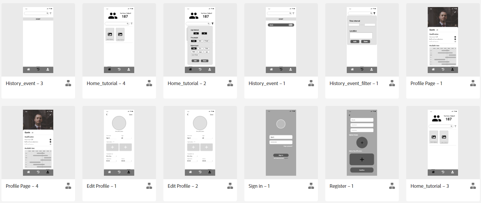
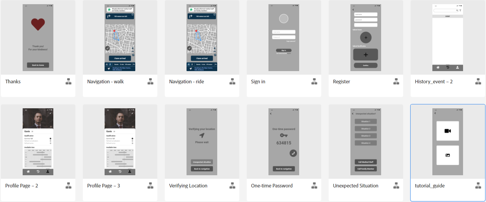
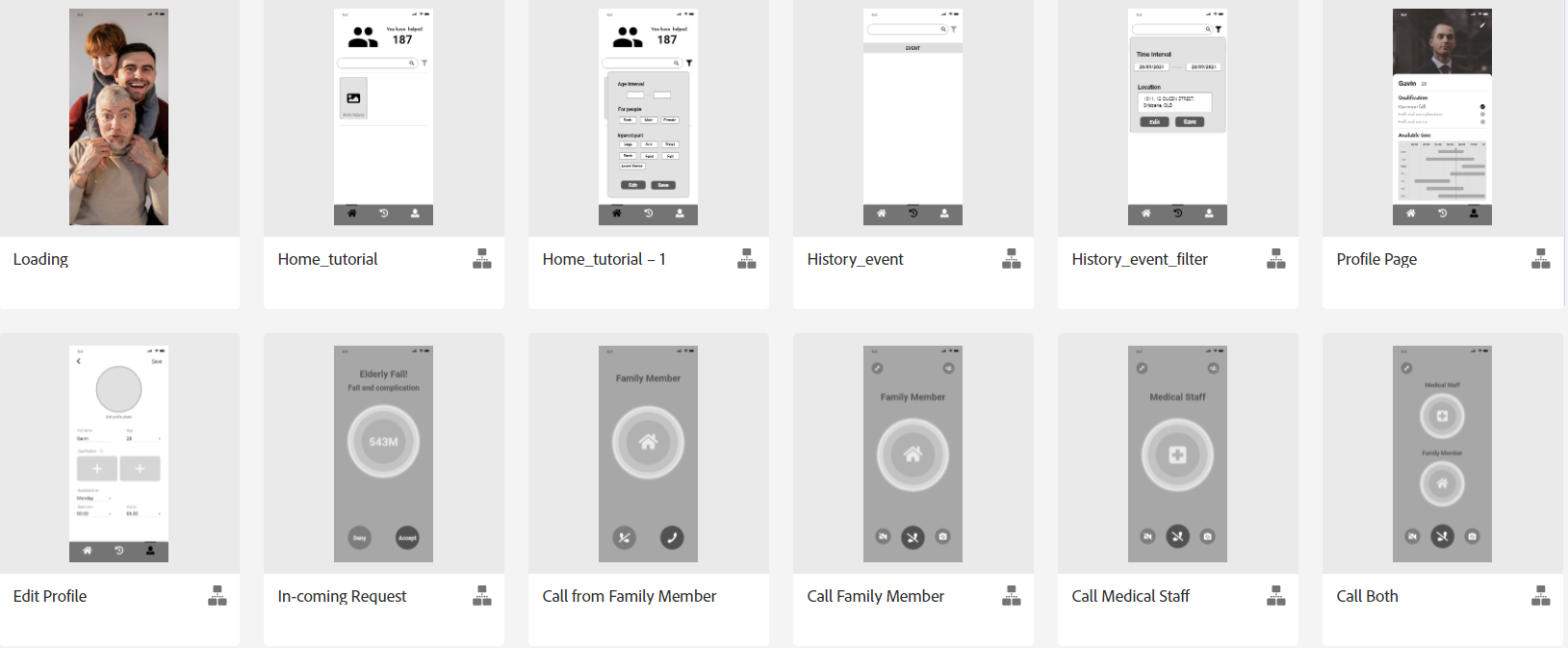
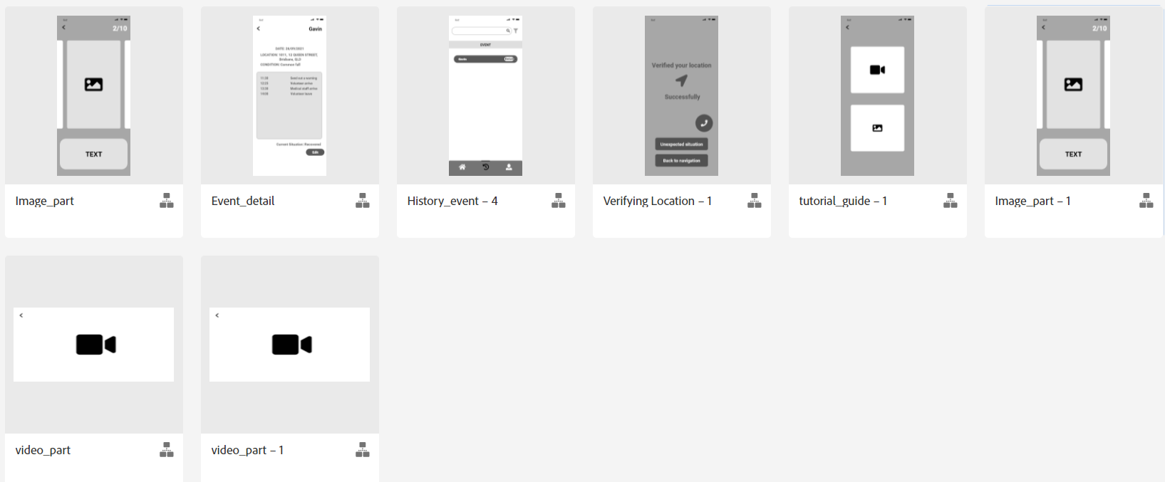
This page shows our medium-fidelity model and describes our medium-fidelity evaluation process. The evaluation process includes templates for the three evaluation methods, the test results and the conclusions obtained by the evaluation process.
The Medium Fidelity Prototype is shown on the Adobe XD
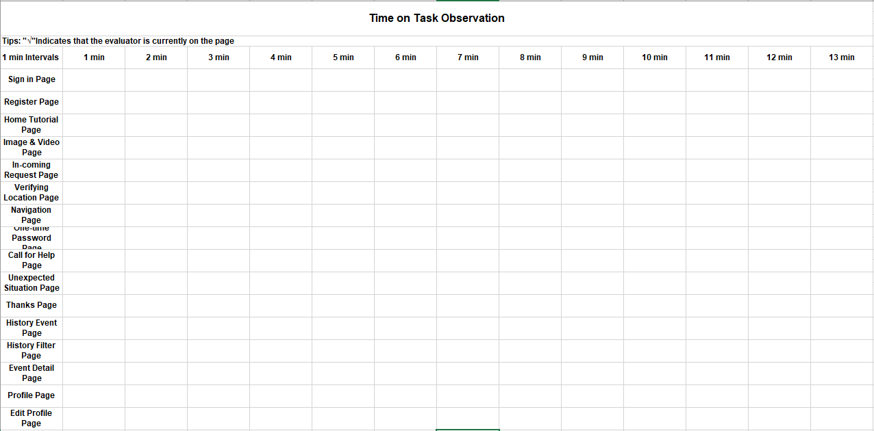
In this evaluation, we need to take two aspects of evaluation. First, we will use Time on Task and Think Aloud to evaluate, so that we can intuitively obtain the user’s feelings and ideas at each stage of the application process. Secondly, we will use an analytic evaluation method called the Cognitive Walkthrough evaluation to allow developers/designers to act as users to analyse all aspects of the application so that we can get clear and intuitive information. These two aspects of evaluation provide us with a lot of data support for the final prototype.
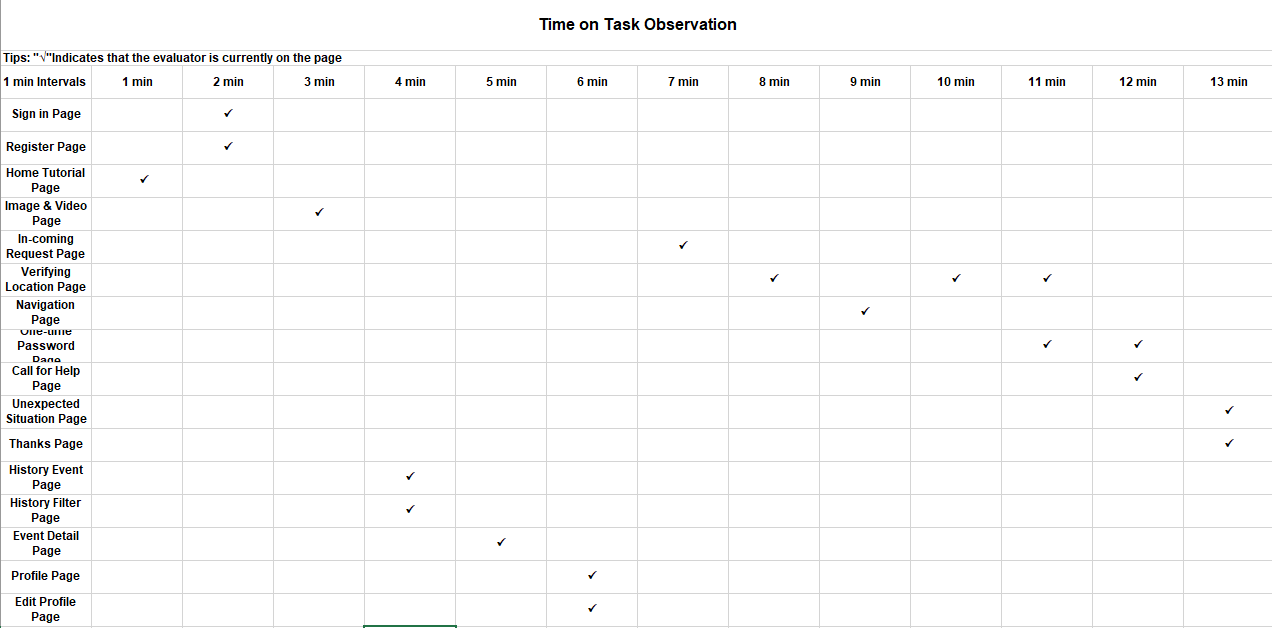
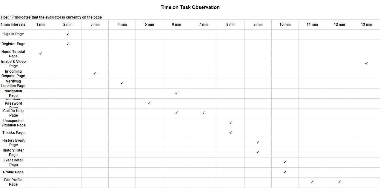
- This participant spends the time pretty even, but a little bit more on the "Verifying Location page"
- This participant looks through some pages for no more than 1 minute, such as the "Sign in the page", "Register page", "History Event page", "History Filter page", "Profile page", "Edit Profile page", "Call for Help page", "Unexpected Situation page" and the "Thanks page".
- The participant spends less than 2 minutes on the " Verifying Location page" and the "One-time Password page".
- This participant spends no more than 1 minute on the "Sign-in page", "Register page", "One-time Password page", "History Filter page" and the "Event Detail page".
- The participant spends less than 2 minutes on the "In-coming Request page", "Verifying Location page", "Navigation page" and the "History Event page".
- The participant spends more than 2 minutes on the "Call for Help page".
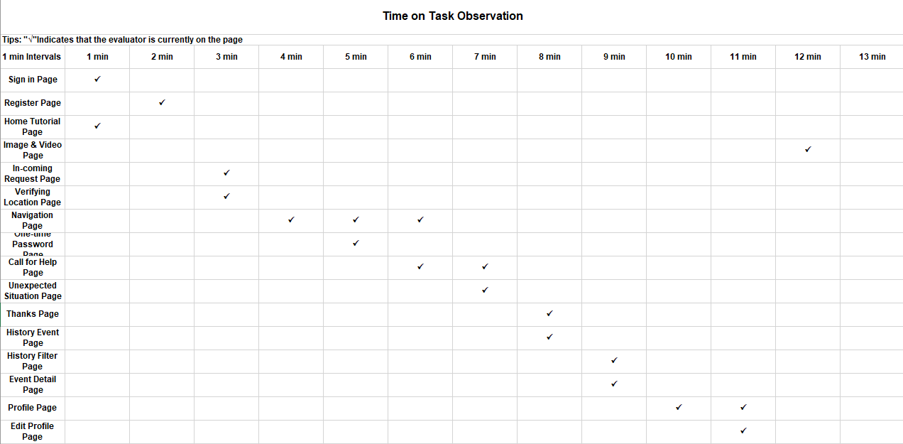
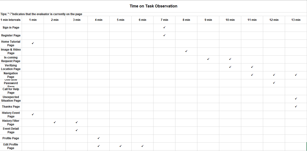
- This participant spends no more than 1 minute on "Sign in page", "Register page", "Home Tutorial page", "In-coming Request page", "Verifying Location page", "One-time Password page", "Unexpected Situation page", "History Event page", "Thanks page", "History Filter page", "Event Detail page" and the "Edit Profile page".
- The participant spends less than 2 minutes on the "Call for Help page", "Profile page"
- The participant spends more than 2 minutes on the "Navigation page".
- This participant also went through the evaluation process very quick.
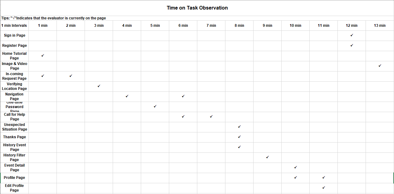
- This participant spends no more than 1 minute on the "Home Tutorial page", "Verifying Location page", "One-time Password page", "Unexpected Situation page", "History Event page", "Thanks page", "History Filter page", "Event Detail page" and the "Edit Profile page".
- The participant spends less than 2 minutes on the "In-coming Request page", "Navigation page", "Call for Help page" and the "Profile page".
- This participant spends no more than 1 minute on almost every page, except the "Call for Help page" and the "Edit Profile page".
- The participant spends less than 2 minutes on the "Call for Help page".
- This participant spends no more than 1 minute on "Sign in page", "Register page", "Home Tutorial page", "Image & Video page", "One-time Password page", "Unexpected Situation page", "History Event page", "Event Detail page", "Thanks page" and the "Profile page".
- The participant spends less than 2 minutes on the "In-coming Request page", "Verifying Location page" and the"History Filter page".
- The participant spends more than 2 minutes on the "Navigation page" and the "Edit Profile page".
- According to the analysis of the evaluation result, we found that most participants went smooth on every page as they correctly explored every page in a short time.
- Most participants spend no more than 1 minute on most pages, except "In-coming Request page", "Call for Help page", "Navigation page" which cost the participant approximately 2 minutes or more to learn and get familiar with.
- However, they did stay somehow longer on the "In-coming Request page", "Navigation page" and the "Call for Help page" which means these sorts of pages may be a little bit complicated for new users.
- We will revise the design and make improvements to the final prototype.
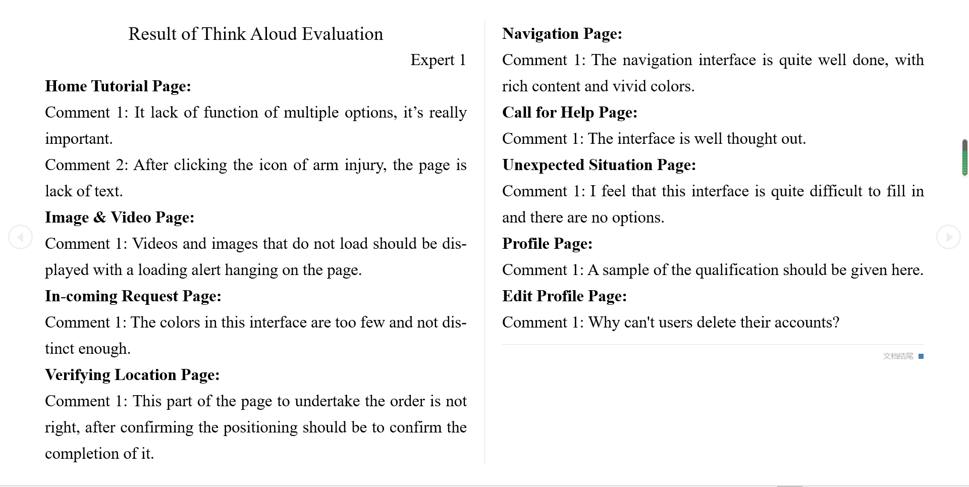
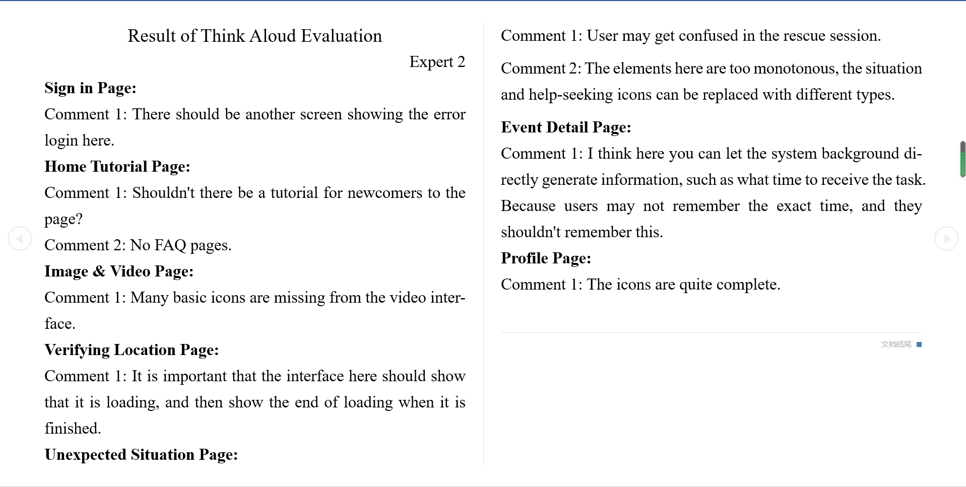
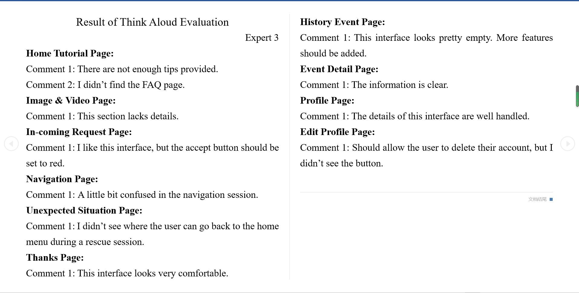
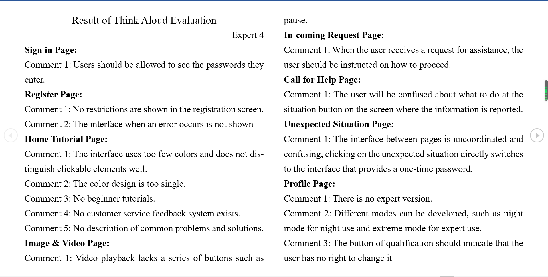
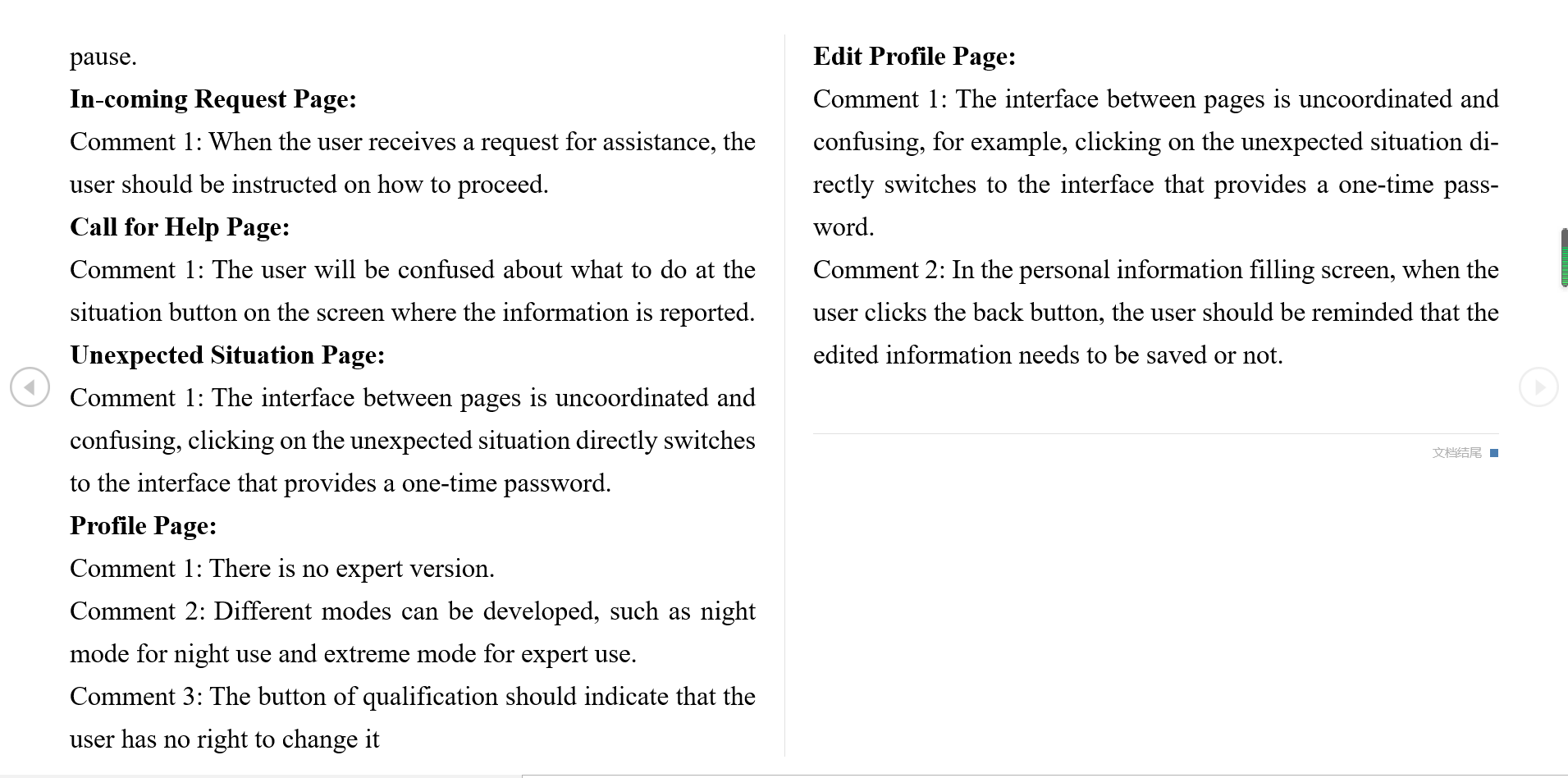
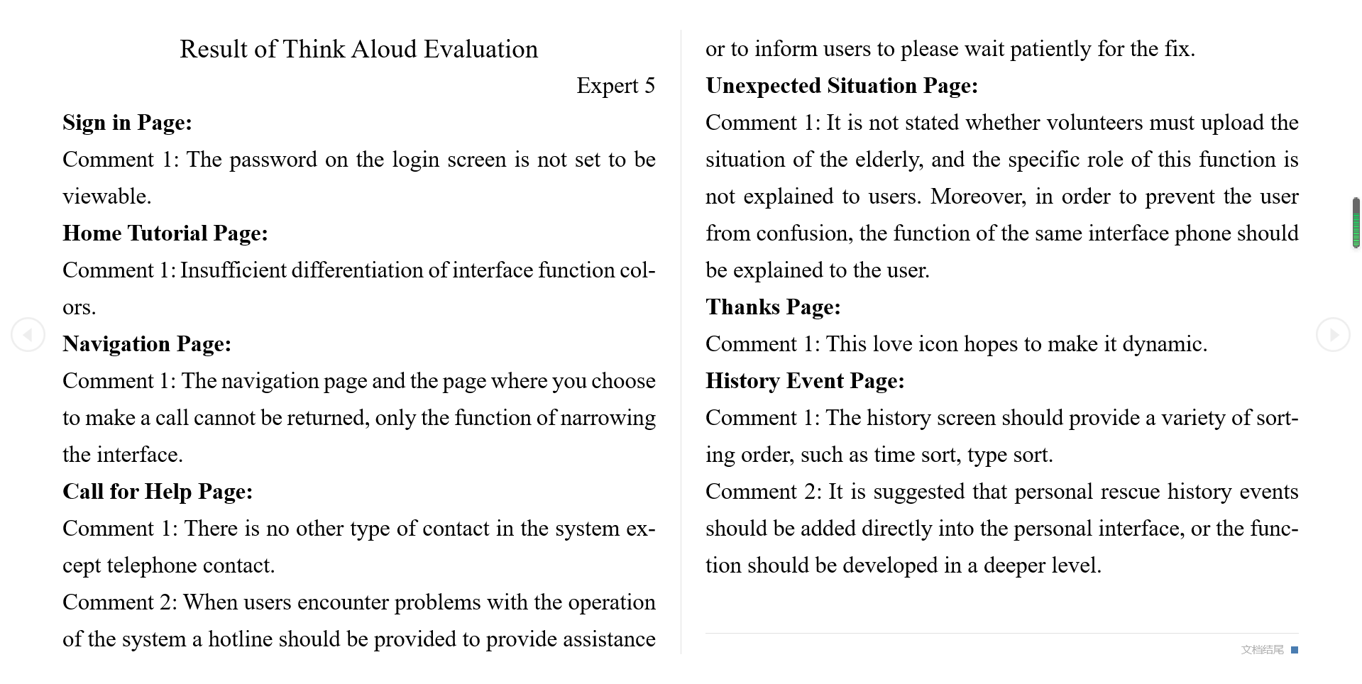
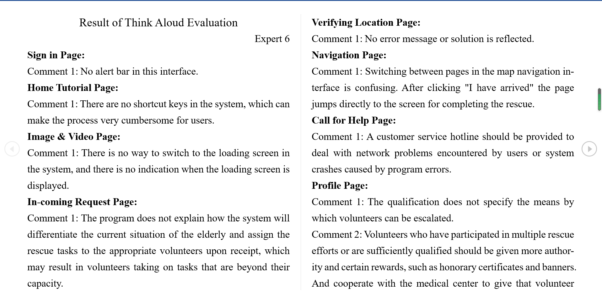
Most participants highly rated the prototype but they also raise some problems that they found during the evaluation.
- The tutorial page is lack details.
- The colour is broad and not distinct enough.
- The user can't delete the account.
- Should be a demonstration of the login error message.
- No FAQ page.
- Should display the loading process
- The user may get confused in the rescue session, the session's flow path should be simpler.
- Should be a pop-up warning when the user leaves the profile setting page without clicking the save.
Reference: Spencer, R. (2000). The streamlined cognitive walkthrough method, working around social constraints encountered in a software development company. Proceedings of the SIGCHI Conference on Human Factors in Computing Systems, 353–359. https://doi.org/10.1145/332040.332456
a. Identification of users
b. Sample tasks for evaluation
c. Action sequences for completing the tasks
d. Description or implementation of the interface
a. Describe the goals of the walkthrough
b. Describe what will be done during the walkthrough
c. Describe what will not be done during the walkthrough
d. Explicitly defuse defensiveness
e. Post ground rules in a visible place
f. Assign roles
g. Appeal for submission to leadership
a. Tell a credible story for these two questions: - Will the user know what to do at this step? - If the user does the right thing, will they know that they did the right thing, and are making progress towards their goal?
b. Maintain control of the CW, enforce the ground rules
a. Possible learnability problems
b. Design ideas
c. Design gaps
d. Problems in the Task Analysis
- First aid volunteers.
a. Creating a new account and log into that account.
b. To watch a tutorial video and view a graphic contextual.
c. To respond to an incoming rescue request and using the embedded navigation system to enroute to the destination, including making a call for either the family member or the medical staff.
a. For this scenario, the evaluator should click the avatar on the home screen to log out of the system. Then, click the register button to enter the account registration page. The virtual user, the evaluator, should at least fill the blanks for username and password. After that, click the finish button, and the system will direct the evaluator back to the logging page, where the evaluator can log into the account that was just created. Finally, click the “Sign In” button to log into the account and see the home screen.
b. To watch a pair of tutorial resources, the evaluator should click the tutorial icon shown on the home screen. Then, a video tutorial and a graphic tutorial will be displayed on the pop-up screen. Click the video icon to watch the video, then click the graphic icon to read the image tutorial, probably provided with some contextual paragraphs. Finally, go back to the home screen.
c. Since there is no actual incoming request for rescue action in the prototype phase, the evaluator should click the number displayed on the right top of the home screen that shows the number of patients this volunteer has helped. Once clicked the number, a simulated rescue request will happen, and the evaluator can accept by tapping the accept button while clicking the deny button will go back to the home screen. After accepting the request, the system will verify the volunteer’s location, and of course, the process is simulated. Next, the evaluator can click the telephone icon to call either the medical staff or the family member of that patient. Once done the phone call, the evaluator should click the hang-up icon, and the “unexpected situation” page will be automatically shown. If no unexpected situation is faced, the evaluator can click the go back button to see the one-time password to access the patient’s accommodation. If something goes wrong, the evaluator can click the telephone icon to call the medical staff or the family member again. If everything goes well, the evaluator can click the “back to navigation” button to enter the navigation page and find the fastest route to the patient’s house. The navigation will offer the most suitable route for both walking and bike riding. Again, the evaluator can make a phone call to the medical staff or the patient’s family member by clicking the telephone icon on this page. Finally, the evaluator can click the “I have arrived” button to finish the navigation, and the system will thank the user for the kindness.
- The evaluator should finish all tasks without the designer’s additional explanation.
- The evaluator will finish a completed simulated rescue.
- Creating a new account and log into that account, watching video and image tutorial materials, accepting an incoming rescue request are the tasks that will be done.
- Changing profile information, checking history data will not be done as these features have not been detailed yet.
- Record data, such as time consumption in each step.
- Enforce ground rules.
- Briefly interviewing every evaluator.
Cognitive Walkthrough Result 1 PDF
Cognitive Walkthrough Result 2 PDF
Cognitive Walkthrough Result 3 PDF
Cognitive Walkthrough Result 4 PDF
Cognitive Walkthrough Result 5 PDF
Cognitive Walkthrough Result 6 PDF
After analysing the result of the cognitive walkthrough evaluation, some problems have been identified:
- More than one participant mentioned that the username setting is lack constraint. There should be a pop-up warning if the provided username is not allowed.
- Some participants suggest adding an entrance for the tutorial contents during the rescue session.
- Many participants argue that the rescue session, which offers a contact portal to medical staff and the family member of the patient, should not end just after the user arrived at the site.
- Some participants suggest adding traffic details on the navigation page for users who use other types of vehicles.
- All six participants perfectly finish the evaluation without requesting additional explanation during the tasks. But they did ask some questions and give suggestions after the evaluation.
- The time of each task that every participant consumed is not too much different, as every participant spent 2-4 minutes for Task A, 5-7 minutes for Task B and 10-11 minutes for Task C.
- After analysing the time consumption, we found that the time consumption is approximately linearly proportional to the level of complication of each task.
- No participant spent an unexpected shorter or longer time to finish each task, which means the difficulties for users to learn and get familiar with the application is fair and even.
- The Cognitive Walkthrough is perfectly done thanks to six participants' valuable suggestions. The time consumption will be assessed and considered whether suitable for a real emergency situation. The problems they raised will be fixed and suggestions will be used to refine the application on the high fidelity prototype.
Prototype Form & Technology Stack
- Part 1 Domain Research
- Part 2 Volunteer Motivation Survey
- Part 3 Survey on the willingness of the elderly
- Part 4 Existing solutions
- Addition reference
Interview and Interview Analysis
- Interview and Results for potential volunteers
- Analysis and Conclusion (for potential volunteers)
- Interview and Results for elderly
- Analysis and Conclusion (for elderly)
- Low Fidelity Prototype
- Low Fidelity Prototype Evaluation
- Low Fidelity Prototype Protocol
- Analysis
- Problems that found from the evaluation
