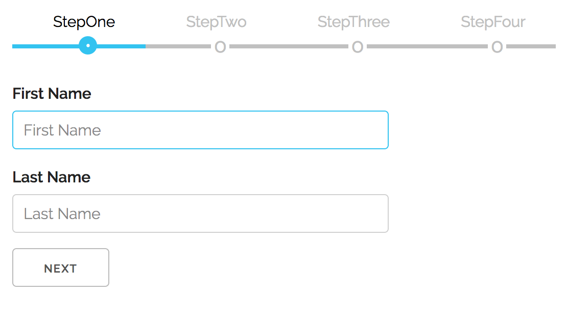
Take it for a SPIN! 💫

Version 5.x.x is in a maintenance mode, the new development is ongoing on v6.x.x. Version (v5.x.x) bug fixes will still be available on NPM, if you would like to open a PR for a fix or make a fork, git checkout branch v5.x.x. The new version, v6.0.0 has a multiple improvements (see below) and is not backwards compatible.
To use this module in your app run:
npm install react-multistepnext, import it inside of your app:
import MultiStep from "react-multistep";and then, in your application, you add your custom components/forms this way:
<MultiStep activeStep={0} prevButton={prevButton} nextButton={nextButton}>
  <StepOne title="Step 1" />
  <StepTwo title="Step 2" />
</MultiStep>
MultiStep component accepts following props (all optional, except Steps array):
| PROPERTY | DESCRIPTION | TYPE | DEFAULT | isRequired |
|---|---|---|---|---|
| showTopNav | controls if the navigation buttons are visible | boolean | true | false |
| prevButton | configure the prev navigation button | NavButtonProp | null | false |
| nextButton | configure the next the navigation button | NavButtonProp | null | false |
| stepCustomStyle | control style of step | CSSProperties | null | false |
| direction | control the steps nav direction | column | row | false |
| activeStep | it takes a number representing representing starting step | number | 0 | false |
🚀 NEW! you can also use style props for the navigation buttons and change how they look with two props 'prevButton' & 'nextButton':
| PROPERTY | DESCRIPTION | TYPE | DEFAULT | isRequired |
|---|---|---|---|---|
| title | The display string value of the navigation button | string | Prev / Next | false |
| style | The css style of the navigation button | CSSProperties | null | false |
    <MultiStep  title: 'Order Workflow'}
                activeStep={2}
                  prevButton={{title: 'Back','style:{ background: 'red' }}}
                nextButton={{title: 'Forward','style:{ background: 'green' }}}
    >
    <StepOne title='StepOne'/>
    <StepTwo title='StepTwo'/>
    <StepThree title='StepThree'/>
    <StepFour title='StepFour'/>
</MultiStep>
When configured this way, each component (Step) of the array can have following two properties:
| PROPERTY | DESCRIPTION | TYPE | DEFAULT | isRequired |
|---|---|---|---|---|
| component | the step representing component | JSX.Element | null | true |
| title | the step title, present above the steps nav | text | step index | false |
To enable this feature, when the child form component needs to control 'Next' navigational button, based on it's local validation, MultiStep dynamically adds a new prop function to child components that should be used to signal validation status. MultiStep will disable /enable Next button accordingly. This function has follwing signature:
signalParent(valid: boolean)
By default the state is false and child components invokes it based on current outcome of the validation. In the example app, a simple checkbox is used to simulate valid/not valid.
This can be seen in the example app, but here are the relevant parts, required inside of the form child component:
Start by cloning the repo locally:
git clone https://github.com/srdjan/react-multistep.gitthen:
cd react-multistep            // (1) navigate to the project folder
npm install                   // (2) install dependencies
npm run build                 // (3) build the component
On a successful build, try the example app:
cd ../example                 // (1) navigate to the example folder
npm install                   // (2) install dependencies
npm run build                 // (3) build the example
npm start                     // (4) start the local server
Now, you can open the example in your favorite browser...
