-
Notifications
You must be signed in to change notification settings - Fork 11
UIConcepts
Visual representation is built using basic elements:
- Panel (have a ''layout'' - aligned, stacked, hbox/vbox, NWES (a.k.a LRBT), with absolute positioning & s.o.; can have a header and footer; everything inside is components and/or panels)
- Component (button, label, input, icon...)
Nothing else, Desktop is a panel with icons as components and with optional panels at sides (so it must have the ability to stick other panels also, not just fit).
Some simple language to build panels, API (as a server, to fit in the UI communication scheme) and GUI Builder must be provided.
Language, for example (or Pythonic, w/o brackets):
[panel Desktop nwse desktop.png
   [icon 32. 16. stretch icon.png] # w/h - 32, t/l - 16
   [icon 32. 16 64 stretch icon.png] # w/h - 32, t - 16, l - 64
   [panel LeftBar vbox
     [icon 32. 16 icon.png]
   ]
   ...
]
Example from Qt Declarative QML:
import Qt 4.6

Rectangle {
    id: container
    property string label
    signal clicked
    radius: 5; border.color: "black"
    color: mouse.pressed ? "steelblue" : "lightsteelblue"
    gradient: Gradient {
            GradientStop { position: mouse.pressed ? 1.0 : 0.0; color: "steelblue" }
            GradientStop { position: mouse.pressed ? 0.0 : 1.0; color: "lightsteelblue" }
    }
    MouseRegion { id: mouse; anchors.fill: parent; onClicked: container.clicked() }
    Text { anchors.fill: parent; text: container.label; anchors.centerIn: parent }
}
про разрешение уи в сантиметрах: design sketches made for 3 main resolutions:
- 900x900 for big-resolution desktops found in big computers
- 600x600 (or 800x600) representing medium-resolution mobile devices
- 480x320 and 320x480 for low-resolution mobile devices in landscape and portrait orientations
Вот такая хренька должна быть доступна в UI для автоматизации задач, вместо cmdline:
-
Slicker (Usability PDF) -- note: use wayback archive or find the pdf in local saves.
Resume:
- Large targets are good
- It is much better when there is a minimum of things on your screen (even hidden from user) +
- fingers ane not good at clicking
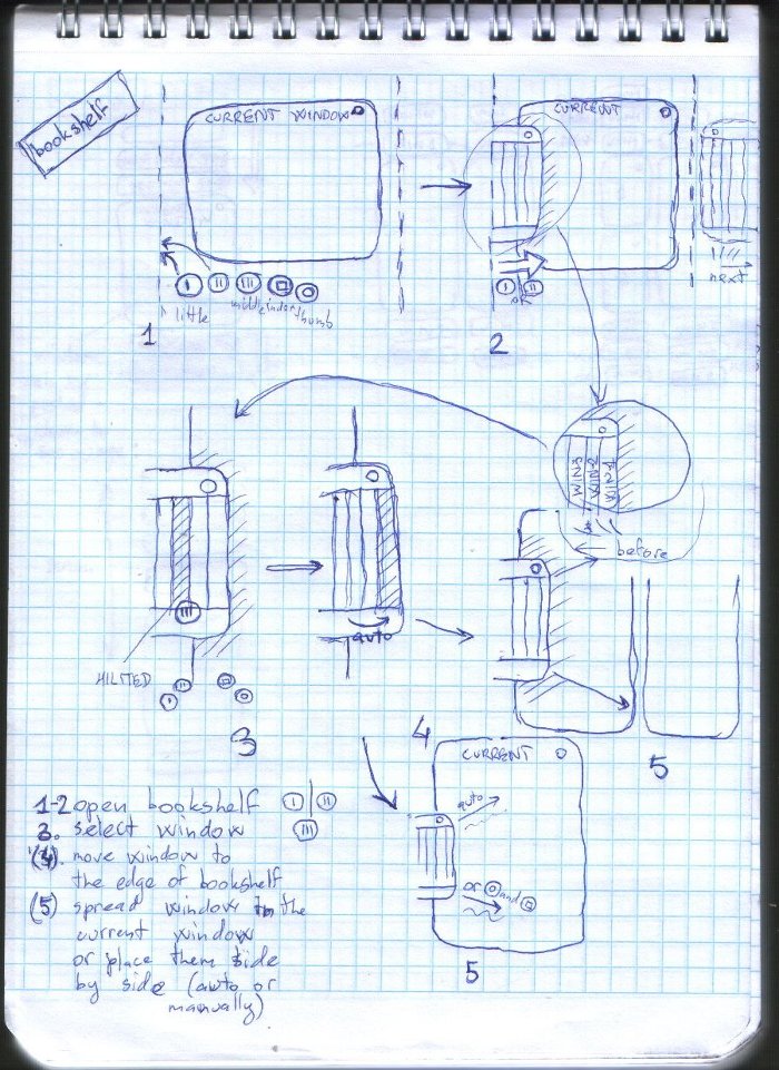
The main idea of the shelf variant is to make the actions with choosing windows similar to taking books from bookshelf.
So, desktop is a concept of horizontal windows stack: any count of minimized (shown as backstrips of books) windows - right shelf, then the opened current window (or several) (a blank list or list with text - "opened book"), and then, again, any count of minimized windows - left shelf. When working with single application, shelves are hidden. When user needs to open one of background applications, he opens a shelf with mouse (ring or little finger for multi-touch), then selects a required window, looking at titles like on backstrips, then clicks it (tips it with any finger), so window is expanded (or stacked near the existing window if multi-window mode is on).
Основная идея - в представлении активных окон (и действий с ними) в виде, схожем с книжной полкой.
Таким образом, рабочий стол представляет из себя горизонтальную стопку активных окон: любое количество свёрнутых (показанных в виде корешков книг) окон - правая полка, затем текущее открытое окно (или несколько) (чистый лист или лист с тектом - "открытая" книга), а затем снова любое количество свёрнутых окон - левая полка. Во время работы с одиним приложением, полки скрыты. Когда пользователю нужно открыть одно из фоновых приложений, он открывает полку кликом мыши (вытягивает мизинцем или безымянным пальцем в случае мультитача), затем выбирает нужное окно из представленных "корешков", кликает по нему (или выбирает пальцем), окно автоматически перемещается к краю полки и разворачивается на весь рабочий стол (или становится рядом с существующим окном в режиме с несколькими окнами).

Drawbacks:
- User needs to remember in what shelf (left or right) his window is located. If there will be a way to make him easily know where window is, the problem will be solved.
- If there is a big number of windows in the shelf, user need to pull it through the screen.
- Desktop becomes visually vertical (or even non-free), seems there is no space at the left or right for zoom or another actions because of shelves. (may be it is no matter if shelves will be hidden when user works with opened applications)
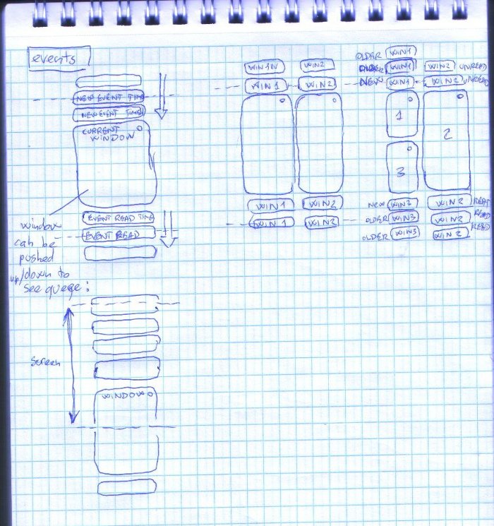
Events are stacked vertically, as an opposite to horizontal shelves. There is a concept of endless events queue, which is divided in two parts: read events and unread events. When event appears, it is attached to the top side of window (from this moment, the most recent event is nearest to the top of the window, the events that appeared previously are moved up and then are hidden from desktop). When event is matched as read (touched with mouse or finger), it moves to the bottom of the window and previous event becomes most recent at the top, so user can see the full history. To see the full list of events (read or new), user moves current window down or up (with palm, for example) according to what he wants to see - so window is not fully visible, but the required part of events queue is seen.
