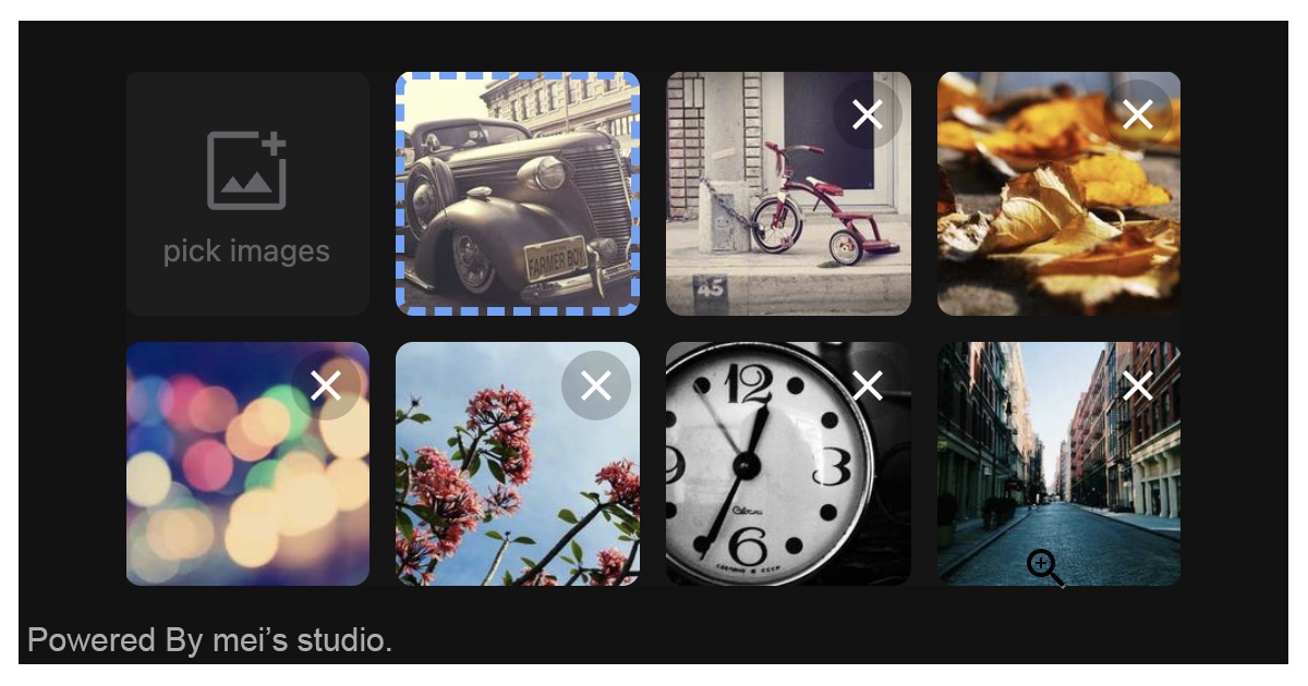
<msc-image-uploader /> is a web component based image uploader. Users could pick & upload images by 「file picker」、「drag & drop」and even direct「paste」image content. Besides that, users could also change images sorting through 「drag & drop」or 「keyboard arrow keys」. With rich config setting, developers can set up placeholder and limitation for different scenarios.
<msc-image-uploader /> is a web component. All we need to do is put the required script into your HTML document. Then follow <msc-image-uploader />'s html structure and everything will be all set.
- Required Script
<script
  type="module"
  src="https://unpkg.com/msc-image-uploader/mjs/wc-msc-image-uploader.js">
</script>Put <msc-image-uploader /> into HTML document. It will have different functions and looks with attribute mutation.
<msc-image-uploader>
  <script type="application/json">
      {
        "fieldname": "image",
        "multiple": true,
        "limitation": {
          "size": 52428800,
          "accept": ".jpg,.jpeg,.png,.gif,.webp,.avif",
          "minwidth": 100,
          "minheight": 100,
          "maxcount": 10
        },
        "placeholder": [
          {
            "src": "https://your-domain/img/img-0.jpg",
            "crumb": "dsaRxsa"
          },
          {
            "src": "https://your-domain/img/img-1.jpg",
            "crumb": "ptScwKdQ"
          }
        ],
        "webservice": {
          "url": "https://your-domain/uploadApi",
          "params": {
            "id": "mei",
            "sex": "M"
          },
          "header": {
            "content-type": "application/json"
          },
          "withCredentials": false,
          "timeout": 30000
        }
      }
  </script>
</msc-image-uploader>
Otherwise, developers could also choose remoteconfig to fetch config for <msc-image-uploader />.
<msc-image-uploader
  remoteconfig="https://your-domain/api-path"
>
</msc-image-uploader><msc-image-uploader /> could also use JavaScript to create DOM element. Here comes some examples.
<script type="module">
import { MscImageUploader } from 'https://unpkg.com/msc-image-uploader/mjs/wc-msc-image-uploader.js';

// use DOM api
const nodeA = document.createElement('msc-image-uploader');
document.body.appendChild(nodeA);
nodeA.webservice = {
  url: 'https://your-domain/uploadApi'
};
nodeA.fieldname = 'image';

// new instance with Class
const nodeB = new MscImageUploader();
document.body.appendChild(nodeB);
nodeB.limitation = {
  accept: '.jpg,.jpeg,.png',
  minwidth: 200,
  minheight: 200
};

// new instance with Class & default config
const config = {
  fieldname: 'image',
  multiple: false,
  limitation: {
    size: 52428800,
    accept: '.jpg,.jpeg,.png,.gif,.webp,.avif',
    minwidth: 100,
    minheight: 100,
    maxcount: 10
  },
  placeholder: [],
  webservice: {
    url: '/',
    params: {},
    header: {},
    withCredentials: false,
    timeout: 30000
  }
};
const nodeC = new MscImageUploader(config);
document.body.appendChild(nodeC);
</script><msc-image-uploader /> will generate an input[type=hidden] as storage and put success uploaded data as its value. <input /> default name is msc-image-upload, developers can switch any name they liked.
<msc-image-uploader>
  <input type="hidden" name="msc-image-uploader" value="..." />
</msc-image-uploader>Developers could apply styles to decorate <msc-image-uploader />'s looking.
<style>
msc-image-uploader {
  --msc-image-uploader-gap: 12px;
  --msc-image-uploader-column-count: 4;
  --msc-image-uploader-dragging-opacity: .5;
  --msc-image-uploader-unit-border-radius: 8px;
  --msc-image-uploader-focus-within-bgc: rgba(255 255 255/.01);

  --msc-image-uploader-main-drop-overlay-color: rgba(0 0 0/.7);
  --msc-image-uploader-main-drop-hint-text-color: rgba(255 255 255);
  --msc-image-uploader-main-drop-hint-text-size: 40px;
  --msc-image-uploader-main-drop-hint-text: 'DROP IMAGES HERE.';

  --msc-image-uploader-label-bgc: rgba(232 234 237/.04);
  --msc-image-uploader-label-color: #606367;
  --msc-image-uploader-label-hint-text: 'pick images';

  --msc-image-uploader-loading-color: rgba(255 255 255);
  --msc-image-uploader-loading-bgc: rgba(0 0 0/.05);
}
</style>
Otherwise, apply pseudo class ::part(decoration) to direct style each unit. Besides that, developers could also apply pseudo class ::part(decoration-{n}) for specific unit.
<style>
msc-image-uploader::part(decorations)::before {
  position: absolute;
  inset-inline-start: 0;
  inset-block-start: 0;
  content: 'image';
  font-size: 12px;
  color: #fff;
  background-color: rgba(0 0 0/.8);
  padding: 2px 6px;
  border-end-end-radius: 4px;
  display: none;
}

msc-image-uploader::part(decorations-1)::before {
  content: '1st';
  color: #f00;
}
</style>
Apply class - msc-image-uploader--blank-trigger will turn trigger into blank mode. That means trigger won't occupy any space and developers could use it for some special cases.
<style>
msc-image-uploader {
  --msc-image-uploader-column-count: 1;
  --msc-image-uploader-gap: 0px;
  --msc-image-uploader-main-drop-hint-text: 'DROP HERE';
  --msc-image-uploader-main-drop-hint-text-size: 16px;
}
</style>

<msc-image-uploader class="msc-image-uploader--blank-trigger">
  <script type="application/json">
    {
      "limitation": {
        "size": 52428800,
        "accept": ".jpg,.jpeg,.png,.gif,.webp,.avif",
        "width": 400,
        "height": 400,
        "maxcount": 1
      },
      "webservice": {
        "url": "https://your-domain/uploadApi",
        "params": {},
        "header": {},
        "withCredentials": false,
        "timeout": 30000
      }
    }
  </script>
</msc-image-uploader><msc-image-uploader /> supports some attributes to let it become more convenience & useful.
- fieldname
Set fieldname for <msc-image-uploader />. Each upload image fetch will apply this ad file's field name. Default is image (not set).
<msc-image-uploader
  fieldname="image"
>
  ...
</msc-image-uploader>- limitation
Set limitation for <msc-image-uploader />. It should be JSON string. <msc-image-uploader /> will go through these rules when user picked files. Default is list in following sample (not set).
size:max file size (byte). Default is52428800.accept:accepted able types. Default is.jpg,.jpeg,.png,.gif,.webp,.avif.minwidth:image min-width (px). Default is100.minheight:image min-height (px). Default is100.maxcount:Max file count. Default is10.
<msc-image-uploader
  limitation='{"size":52428800,"accept":".jpg,.jpeg,.png,.gif,.webp,.avif","minwidth":100,"minheight":100,"maxcount":10}'
>
  ...
</msc-image-uploader>- webservice
Set web service information for <msc-image-uploader />. It should be JSON string. Developers could set url、params、header、withCredentials and timeout here.
url:api address for upload image. Default is/.params:Set parameters. Each of them will be attached with fetch. Default is{}.header:Set fetch header. Default is{}.withCredentials:Set withCredentials for fetch. Default isfalse.timeout:Set timeout for fetch. Default is30000(ms).
<msc-image-uploader
  webservice='{"url":"/","params":{},"header":{},"withCredentials":false,"timeout":30000}'
>
  ...
</msc-image-uploader>- placeholder
Set placeholder for <msc-image-uploader />. It should be JSON string. Each element should include src for thumbnail display. Default is [] (not set).
<msc-image-uploader
  placeholder='[{"src":"https://your-domain/img/img-0.jpg","other":"xxx"},{"src":"https://your-domain/img/img-1.jpg","other":"xxx"}]'
>
  ...
</msc-image-uploader>- multiple
Enable <msc-image-uploader /> multiple files picked mode. Default is false (not set).
<msc-image-uploader
  multiple
>
  ...
</msc-image-uploader>| Property Name | Type | Description |
|---|---|---|
| fieldname | String | Getter / Setter for fieldname. Each upload image fetch will apply this ad file's field name. Default is image (not set). |
| limitation | Object | Getter / Setter for limitation. will go through these rules when user picked files. |
| webservice | Object | Getter / Setter for web service information. Developers could set url、params、header、withCredentials and timeout. |
| placeholder | Array | Getter / Setter for placeholder. Each element should include src for thumbnail display. Default is [] (not set). |
| multiple | Boolean | Getter / Setter for multiple. Enable multiple files picked mode. Default is false (not set). |
| processing | Boolean | Getter for 's fetching status. |
| uploadInfo | Array | Getter for 's current uploaded information. Developers could check error key exist to know data is clean to take or not. |
| count | Number | Getter for current 's uploaded units count. |
| Method Signature | Description |
|---|---|
| showPicker | Summon native file picker. |
| removeAll | Remove all uploaded units. |
| Event Signature | Description |
|---|---|
| msc-image-uploader-pick | Fired when users picked files. |
| msc-image-uploader-error | Fired when occured errors (validation & fetch). Developers can gather information through event.detail. ( will put server response to event.detail.cause) |
| msc-image-uploader-remove | Fired when removed unit successed. |
| msc-image-uploader-upload-done | Fired when finished fetching. |

