This is a starter repo to learn the basics of CSS Grid.
Note: you'll need node.js on your computer
- Download Firefox (we'll be using Firefox's CSS grid dev tools)
- Clone down the repo:
git clone https://github.com/letakeane/learn-grid.git - To view your code, run
npm start - After making changes, simply
cmd + rin your browser to see your updates.
CSS grid is part of CSS3 and allows us to create grid-based layouts that are intuitive and responsive.
Why grids? You can read up on grid-based design principles here and here.
If you're familiar with flexbox, jumping into grid can be pretty smooth.
Like flexbox, grid makes use of containers and items.
You'll notice in our initial setup, there is a div (with a class of 'container'), that encompasses 26 child div elements (each with a shared class of 'item' as well as a unique class so we can target individual elements if necessary).
Like flexbox, we'll turn the container into a grid, and the items inside it will be the elements of the grid.
We can specify the size and location of our elements, or allow them to flow naturally into the available space of the grid.
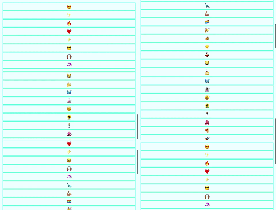
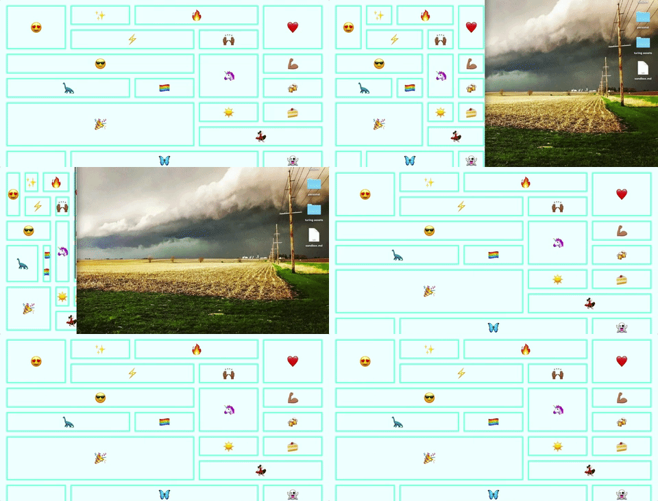
Right now, this is what we see when we start up our server and navigate to our html file:
To make a container into a grid, we make use of the display property, and set its value to grid.
.container {
  display: grid;
}
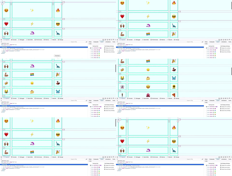
Now, nothing appears different, but if we open up our dev tools, click the Layout tab, and check the box next to div.container, we can see that our container is now a grid.
If we zoom in, we can see that there are a couple different types of lines here:
We'll get into what these indicate later - for now, note that the solid line is the edge of the grid in its entirety.
We also have these numbers, as well, which describe the lines surrounding our grid items.
Vocab:
- grid line: the lines between grid items
- grid tracks: each row or column of grid items
Grid allows us to create templates for our columns and rows.
Hint: depending on your text editor, you can type gtc or gtr, hit tab, and have the grid template property filled out for you!
Let's create three columns, one that is 100px wide, one that's 500px wide, and another 100px wide column.
.container {
  display: grid;
  grid-template-columns: 100px 500px 100px;
}
Let's also add a gap between our grid items:
.container {
  display: grid;
  grid-gap: 20px;
  grid-template-columns: 100px 500px 100px;
}What do you notice about the grid-inspector dev tool lines dividing up our grid? What do you think they indicate?
What do you notice about the numbers in the dev tools? Why might it be useful to know those numbers?
- Explicit: columns or rows explicitly created (with templates, etc)
- Implicit: columns or rows that have not been explicitly defined
Try adding a template for a few rows, using the property grid-template-rows!
We just hard coded in some values for our grid template. What if we want the grid to take up space based on the current width of the window?
In the past, we've all used percentages and done the awkward math dance of trying to account for padding and margins and elements with fixed widths.
Fortunately for us, we have access to a new type of unit, known as the fractional unit, and represented as fr.
Let's refactor our previous code.
.container {
  display: grid;
  grid-gap: 20px;
  grid-template-columns: 1fr 1fr 1fr;
}
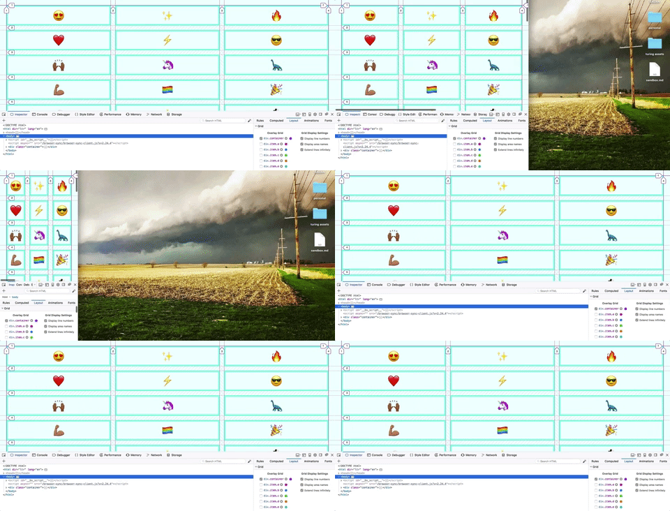
What happens when you change the width of the window?
(also, awkward welcome to my desktop background)
Fancy! By using fractional units, each column takes up a third of the space left over after accounting for the grid gaps between each track.
Try mixing pixels, frs, and autos! Try changing the content of one or two of the items so it's much longer than the other single emojis! What happens?
We also have a handy function available to us: repeat()!
repeat() takes in two arguments:
- the number of times we want to repeat the pattern
- the pattern
For example, let's give our container element this css:
.container {
  display: grid;
  grid-gap: 20px;
  grid-template-columns: repeat(2, 1fr 2fr);
}
What do you think will happen?
We can size individual items in our grid.
Let's target our first and our fifth item, a and e respectively. If we set up our grid template to have five equally sized columns:
.container {
  display: grid;
  grid-template-columns: repeat(5, 1fr);
  grid-gap: 20px;
}
then we can determine how many tracks we want our e item to span. And, in fact, our keyword is span! Handy!
.e {
  grid-column: span 2;
}
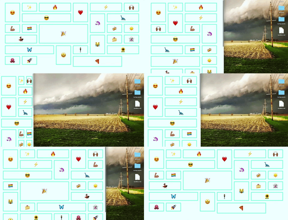
What happened? The lightning bolt is now on a separate line and there's a weird gap behind the heart.
There isn't enough room in our grid for the lightning bolt to stretch out to take up two tracks unless it starts on a new line. There's a way for us to fill in those holes and let things flow naturally into place, but we'll get to that in a moment.
We can also span rows!
.a {
  grid-row: span 2;
}
Let's look at some other ways we can size and place our grid items.
Another way we can place elements is by specifying their beginning and ending lines. Let's look at our dev tools.
Look at the fire item - item c - what line does it begin on? 3, right? And it extends to line 4. We can make it take up three tracks (i.e. spaces between lines) by specifying a new start and end.
.c {
  grid-column-start: 3;
  grid-column-end: 6;
}
This can also be represented with the following shorthand:
.c {
  grid-column: 3 / 6;
}
We can also mix and match line numbers and spans.
.c {
  grid-column: 3 / span 3;
}
And if we wanted one item to stretch the whole breadth of the columns, we could use this shorthand:
.i {
  grid-column: 1 / -1;
}
This works because, as you can see in the dev tools, the right-most line of the grid is labeled -1.
Now, if we wanted to make our grid fill in gaps automatically, we can make use of the grid-auto-flow property, and set it to dense. It isn't perfect, but it will do its best to fill in the holes.
.container {
  display: grid;
  grid-template-columns: repeat(5, 1fr);
  grid-gap: 20px;
  grid-auto-flow: dense;
}
Okay, that looks pretty nice.
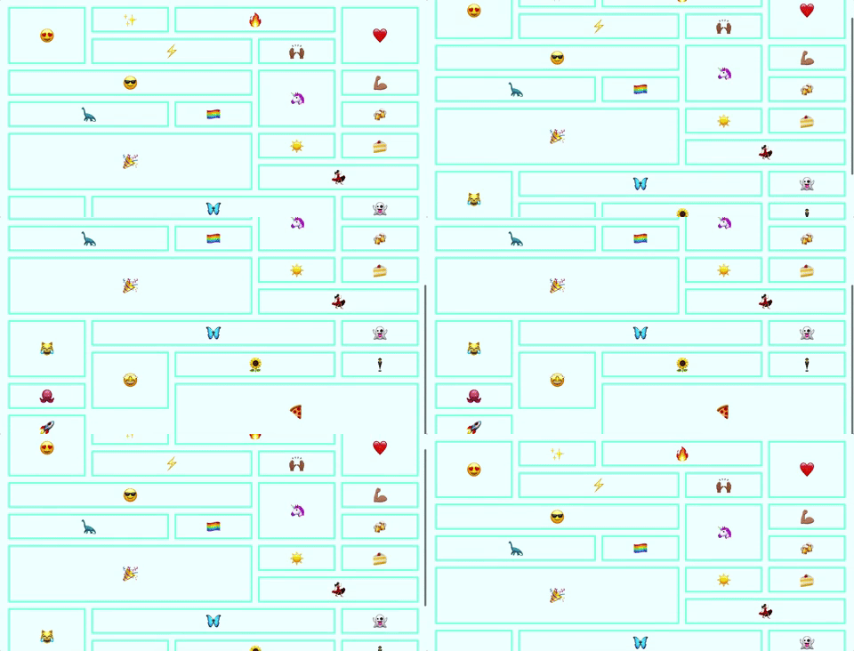
We can really see the effectiveness of dense if we make several of our items different sizes:
Let's target several items:
c, i, o, u {
  grid-column: span 2;
}

d, h, l, p, t, x {
  grid-row: span 2;
}

f, l, r, x {
  grid-column: span 3;
}
Neat! But - hey, this looks SUPER gross from a responsive standpoint.
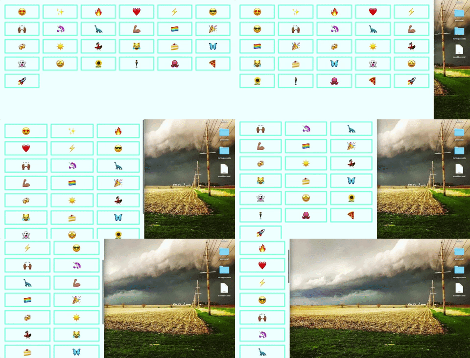
Wouldn't it be great if the number of columns adjusted dynamically according to the window width?
Auto-fit and auto-fill lets the grid detect the window and display itself dynamically.
Auto-fit and auto-fill behave very similarly, but they handle setting the explicit bounds of the grid. Auto-fit ends the grid at the end of the items. Auto-fill predicts how many items could fit on the page and ends the grid there.
.container {
  display: grid;
  justify-content: center;
  grid-template-columns: repeat(auto-fit, 150px);
  grid-gap: 20px;
  grid-auto-flow: dense;
}
So now we have responsiveness without writing a single media query.
Let's get rid of all the .item:nth-child and individual lettered rules so we can take a look at minmax().
minmax() takes two arguments:
- the minimum size
- the maximum size
In the example below, we are creating a grid template for our columns: we want as many columns as will fit across the window, and we want them to be at a minimum 200px wide, and at a maximum, the entire width of the grid wide.
.container {
  display: grid;
  justify-content: center;
  grid-template-columns: repeat(auto-fit, minmax(200px, 1fr));
  grid-gap: 20px;
  grid-auto-flow: dense;
}
Lovely!
Grid also allows us create named content areas, which helps make our code more semantic, using some cool visual shorthand.
Let's add a few wrapping divs to our HTML.
<body>
  <div class='container'>
    <div class='item sidebar'>SIDEBAR</div>
    <div class='item main-content'>
      <p>MAIN CONTENT</p>
      <p>MAIN CONTENT</p>
      <p>MAIN CONTENT</p>
    </div>
    <div class='item footer'>FOOTER</div>
  </div>
</body>
And let's update our CSS:
.container {
  display: grid;
  justify-content: center;
  grid-template-columns: repeat(3, 1fr);
  grid-gap: 20px;
}

.sidebar {
  background: mistyrose;
}

.main-content {
  background: lightcoral;
}

.footer {
  background: palevioletred;
}
Okay! Let's start naming stuff.
To do this, we need to create a template in the container:
.container {
  display: grid;
  justify-content: center;
  height: 100%;
  grid-template-columns: repeat(3, 1fr);
  grid-gap: 20px;
  grid-template-areas:
  "sidebar main main"
  "sidebar footer footer";
}
and we need to tie our elements to those named content area templates:
.sidebar {
  grid-area: sidebar;
  background: mistyrose;
}

.main-content {
  grid-area: main;
  background: lightcoral;
}

.footer {
  grid-area: footer;
  background: palevioletred;
}Can you use CSS grid to recreate an ecommerce layout similar to this one?
Give it a shot!
- CSS Tricks' visual guide to grid
- Best practices to consider
- Wes Bos's EXCELLENT (and free!) CSS Grid video tutorials, to which I owe pretty much all of these demonstrations, ngl.
