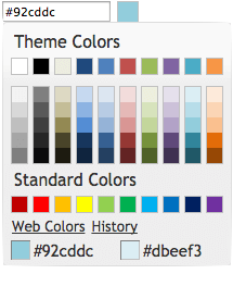
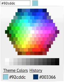
This project is a web color picker which look like the one in Microsoft Office 2010. It can be used inline or as a popup binded to a text box. It is a full jQuery UI widget, supporting various configurations and themes.
Check the demo for several examples.
First, load jQuery (v1.7 or greater), jQuery UI (v1.8 or greater), and the plugin:
<script src="https://ajax.googleapis.com/ajax/libs/jquery/1.7.2/jquery.min.js" type="text/javascript" charset="utf-8"></script>
<script src="https://ajax.googleapis.com/ajax/libs/jqueryui/1.8.18/jquery-ui.min.js" type="text/javascript" charset="utf-8"></script>
<script src="js/evol.colorpicker.min.js" type="text/javascript" charset="utf-8"></script>
The widget requires a jQuery UI theme to be present, as well as its own included base CSS file (evol.colorpicker.css). Here we use the "ui-lightness" theme as an example:
<link rel="stylesheet" type="text/css" href="http://ajax.googleapis.com/ajax/libs/jqueryui/1.8.18/themes/ui-lightness/jquery-ui.css">
<link href="css/evol.colorpicker.css" rel="stylesheet" type="text/css">
Now, let's attach it to an existing <input> tag:
<script type="text/javascript">
    $(document).ready(function() {
        $("#mycolor").colorpicker();
    });
</script>

<input style="width:100px;" id="mycolor" />
This will wrap it into a "holder" <div> and add another <div> beside it for the color box:
<div style="width:128px;">
   <input style="width:100px;" id="mycolor" class="colorPicker evo-cp0" />
   <div class="evo-colorind" style="background-color:#8db3e2"></div>
</div>
Using the same syntax, the widget can also be instanciated on a <div> or a <span> tag to show inline. In that case the generated HTML is the full palette.
evol.colorpicker is as easily themeable as any jQuery UI widget, using one of the jQuery UI themes or your own custom theme made with Themeroller.
evol.colorpicker provides several options to customize its behaviour:
Have the colorpicker appear automatically when the field receives focus ("focus"), appear only when a button is clicked ("button"), or appear when either event takes place ("both"). This option only takes effect when the color picker is instanciated on a textbox.
$("#mycolor").colorpicker({
    showOn: "button"
});
Defaults to "both".
Used to translate the widget. It is a coma separated list of all labels used in the UI.
$("#mycolor").colorpicker({
    strings: "Couleurs de themes,Couleurs de base,Plus de couleurs,Moins de couleurs"
});
Defaults to "Theme Colors,Standard Colors,More Colors,Less Colors".
Used to set the default color value.
$("#mycolor").colorpicker({
    color: "#ffffff"
});
Defaults to null.
This event is triggered when a color is selected.
$("#mycolor").on("change.color", function(event, color){
    $('#title').attr('style','background-color:'+color);
})
This event is triggered when the mouse mouves over a color box on the palette.
$("#mycolor").on("mouseover.color", function(event, color){
    $('#title').attr('style','background-color:'+color);
})
Get the currently selected color value (returned as a string).
$("#mycolor").colorpicker("enable");
Get the currently selected color value (returned as a string).
$("#mycolor").colorpicker("disable");
Get the currently selected color value (returned as a string).
$("#mycolor").colorpicker("isDisabled");
Get or set the currently selected color value (as a string, ie. "#d0d0d0").
$("#mycolor").colorpicker("val");

$("#mycolor").colorpicker("val", "#d0d0d0");
Show the palette (when using the widget as a popup).
$("#mycolor").colorpicker("showPalette");
Hide the palette (when using the widget as a popup).
$("#mycolor").colorpicker("hidePalette");
evol.colorpicker.js has been tested for the following browsers:
- Internet Explorer 7+
- Firefox 9+
- Chrome 21+
- Safari 5+
Copyright (c) 2012 Olivier Giulieri.
evol.colorpicker is released under the MIT license.

