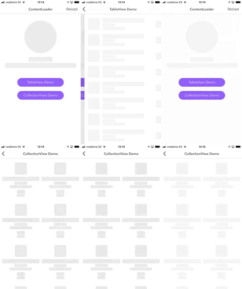
Display awesome animated placeholder loading to your content. Use your custom views to generate low-contrast blocks, with the same shapes, positions. Make beautiful animations using your own format as Slack, Instagram, or Facebook does. ContentLoader is written in Swift 5 with iOS customizable and easy to use.
- Awesome animations on loading
- Totally customizable
- Use it also in your own tables and collection views
- Easy usage
- Supports iOS, developed in Swift 5
- Description
- Example
- Installation
- Usage
- Animation Types
- Apps using ContentLoader
- Author
- Contributing
- License
ContentLoader is available through CocoaPods. To install
it, simply add the following line to your Podfile and run pod install:
pod 'ContentLoader'Then you can import it when you need
import ContentLoaderIn the example you will see some custom content loaders that can be used in your project. Once you've installed the pod, follow next steps. It's really simple:
Select one of your custom view controllers. Choose the views inside this viewcontroller where would like to make Loadable and set isLoadable view property to true. Those views will convert to loadable objects when ContentLoader is loading. If you are using xibs / storyboards, you can see new editable Is Loadable property.
If you are using Table or Collection views, you can make the same with your cells. Make Loadable the views you want. Then, you must implement ContentLoaderDataSource to complete some data ContentLoader needs to draw loader objects. It's really simple:
extension TableViewController: ContentLoaderDataSource {

    /// Number of sections you would like to show in loader
    func numSections(in contentLoaderView: UIView) -> Int {
        return 1
    }

    /// Number of rows you would like to show in loader
    func contentLoaderView(_ contentLoaderView: UIView, numberOfItemsInSection section: Int) -> Int {
        return 10
    }

    /// Cell reuse identifier you would like to use (ContenLoader will search loadable objects here!)
    func contentLoaderView(_ contentLoaderView: UIView, cellIdentifierForItemAt indexPath: IndexPath) -> String {
        return "MyCellReuseIdentifier"
    }
}You can format ContentLoader with your own parameters. See default values:
var format = ContentLoaderFormat()

/// Loader objects color
format.color = UIColor.lightGray

/// Loader objects corner radius
format.radius = 5

/// Loader animation type
format.animation = .fadeSimple ;)
view.startLoading()
// or
view.startLoading(format: format)view.hideLoading()In case of table or collection views
tableView.startLoading()
// or
tableView.startLoading(format: format)tableView.hideLoading()This type will make fade animation when content is loading
ContentLoaderAnimation.fadeThis type will make gradient animation when content is loading (coming soon)
ContentLoaderAnimation.gradient(UIColor, UIColor)(Start color, End color)
If you use ContentLoader I'd love to hear about it and feature your app here!
Alberto Aznar, [email protected] Based on Skeleton View by Juanpe Catalán.
Feel free to collaborate with ideas 💭, issues
- Fork it!
- Create your feature branch:
git checkout -b my-new-feature - Commit your changes:
git commit -am 'Add some feature' - Push to the branch:
git push origin my-new-feature - Submit a pull request :D
ContentLoader is available under the MIT license. See the LICENSE file for more info.


)


