Add this suggestion to a batch that can be applied as a single commit.
This suggestion is invalid because no changes were made to the code.
Suggestions cannot be applied while the pull request is closed.
Suggestions cannot be applied while viewing a subset of changes.
Only one suggestion per line can be applied in a batch.
Add this suggestion to a batch that can be applied as a single commit.
Applying suggestions on deleted lines is not supported.
You must change the existing code in this line in order to create a valid suggestion.
Outdated suggestions cannot be applied.
This suggestion has been applied or marked resolved.
Suggestions cannot be applied from pending reviews.
Suggestions cannot be applied on multi-line comments.
Suggestions cannot be applied while the pull request is queued to merge.
Suggestion cannot be applied right now. Please check back later.
New issue
Have a question about this project? Sign up for a free GitHub account to open an issue and contact its maintainers and the community.
By clicking “Sign up for GitHub”, you agree to our terms of service and privacy statement. We’ll occasionally send you account related emails.
Already on GitHub? Sign in to your account
Add: Delete template action. #31678
Add: Delete template action. #31678
Changes from 1 commit
afa93c1b98025fba756a55880d2da2deb7523a6e0e8def5f5ff30472File filter
Filter by extension
Conversations
Jump to
There are no files selected for viewing
There was a problem hiding this comment.
Choose a reason for hiding this comment
The reason will be displayed to describe this comment to others. Learn more.
What is a suitable context for this button?
What do we call the
modalpopover, "Template options"?There was a problem hiding this comment.
Choose a reason for hiding this comment
The reason will be displayed to describe this comment to others. Learn more.
Yes the aria-label sounds good to me 👍
There was a problem hiding this comment.
Choose a reason for hiding this comment
The reason will be displayed to describe this comment to others. Learn more.
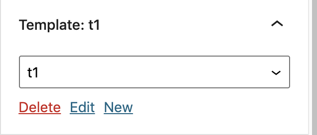
If we want to achieve something like the example:

I think it's probably better to avoid using a NavigableMenu/MenuGroup/MenuItem, which should generally only be used for vertical list menus. Those components are not needed in a plain dropdown and will make it difficult to achieve the desired result. I think the screenshot above is closer to something like the Link UI in terms of the way it's presented. Arrow key navigation isn't needed for that kind of component, tabs are fine.
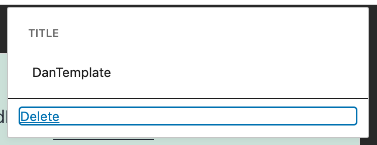
An example is here where the Delete button takes up the full width because it's a menu item (and some of the other styles aren't quite right):

There was a problem hiding this comment.
Choose a reason for hiding this comment
The reason will be displayed to describe this comment to others. Learn more.
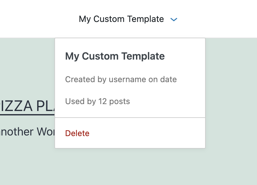
Although I see in the issue that this is the latest quick win design:

I still think it'd be better not to use NavigableMenu because there's only one button that can be tabbed to.
There was a problem hiding this comment.
Choose a reason for hiding this comment
The reason will be displayed to describe this comment to others. Learn more.
A close button needs to be added because it is now a keyboard trap.
There was a problem hiding this comment.
Choose a reason for hiding this comment
The reason will be displayed to describe this comment to others. Learn more.
Oh, there are some other designs proposed in this PR as well, not sure which is the latest 😄
Escape or clicking outside should be fine, most popovers in the editor do this.
There was a problem hiding this comment.
Choose a reason for hiding this comment
The reason will be displayed to describe this comment to others. Learn more.
This menu is clickable and focusable but doesn't actually do anything.
I suggest not adding this as a menu until there is an action.
There was a problem hiding this comment.
Choose a reason for hiding this comment
The reason will be displayed to describe this comment to others. Learn more.
Agree, the user already clicked on a button with the template name, so making this focusable doesn't add anything.
There was a problem hiding this comment.
Choose a reason for hiding this comment
The reason will be displayed to describe this comment to others. Learn more.
As mentioned here, this should be an input, not a menu item.