This is a website used by students to enter and compare their subject choices and classes with other students.
Check it out
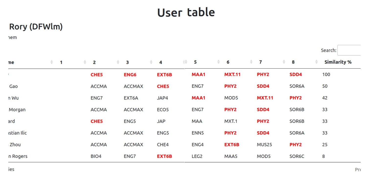
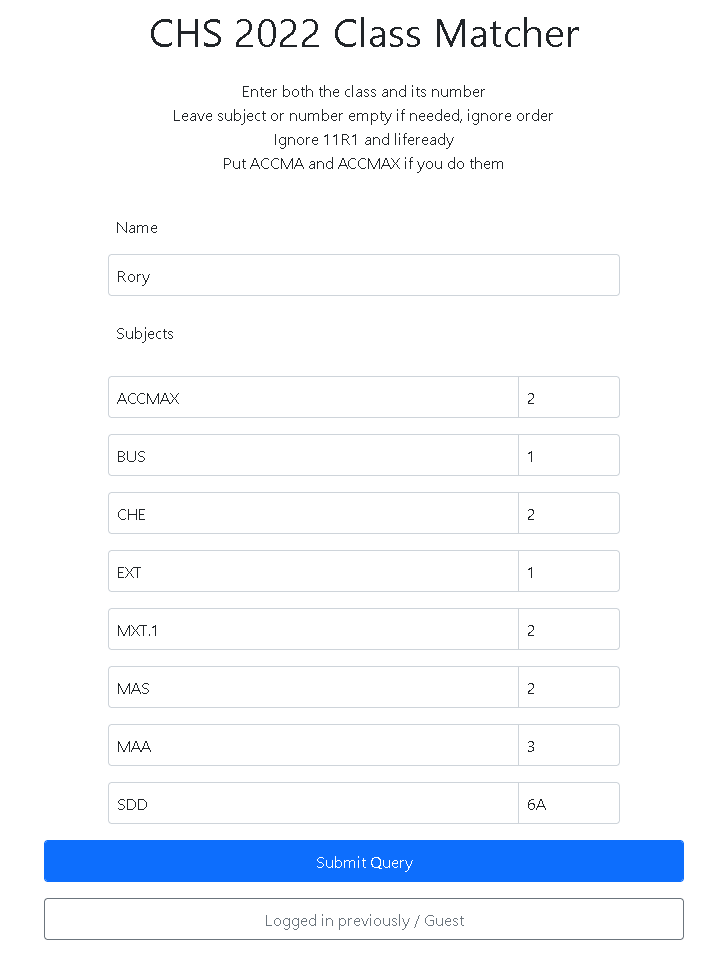
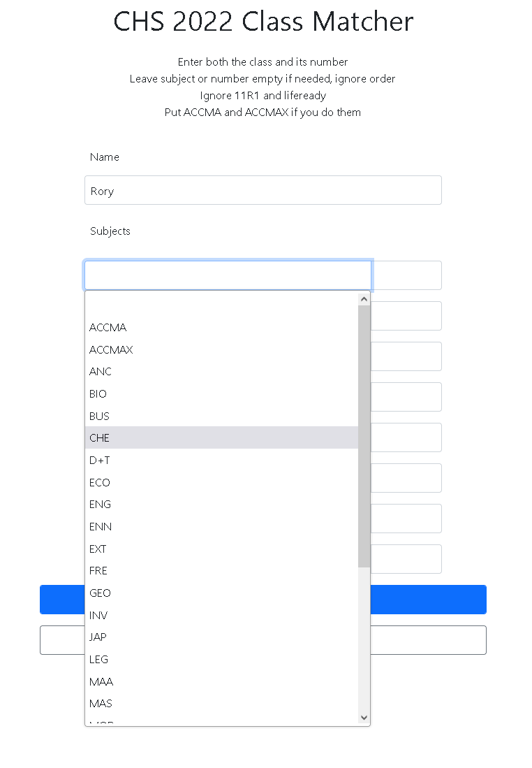
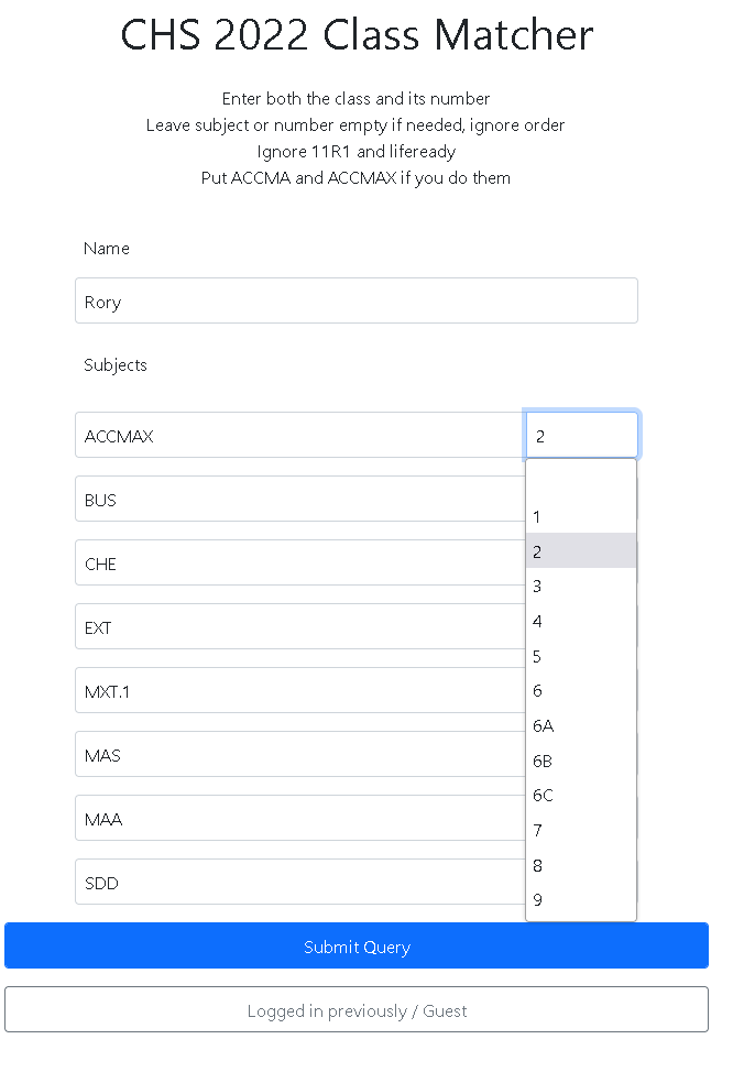
Unfortunately heroku isn't free anymore so the data got deleted, here's what it used to look like. it should explain itself for the most part
This is the only 2 pictures i have of the main table with data in it that i combined from my instagram sorry lol
The red subjects are the subjects shared with the selected user, and you could select a user by clicking their name on the table or if you just submitted data that would be your selected user. You could also sort by all the fields in the table or use the search bar in the corner. I used https://datatables.net/ so you can try it there, very fun to play around with. This had about 70 users at its peak, about half the grade which is pretty insane

Since I pretty much made the same thing last year I decided to also make visualisations for the data. The way I did it was a bit rough but it worked out pretty well. Very satisfying putting the data to good use.
- Create a square matrix of the similarity % between each person and each other person
- Standardise data with the default standard scaler
- Feed the whole thing into the PCA algorithm
- Apply KMeans clustering for nice colouring
- Put the names next to the dots
What this algorithm does is place similar people close together, will explain below.
AMM - Accelerated Math Mixing ACC - Accuracy (how much of the data is conserved when squished down to the 2D graph) Classes/Subjects - Similarity of individual classes the school places them in vs similarity of chosen subjects
Colours are chosen by the algorithm when generated so blue may mean something different in each graph
- This graph places people with similar classes together, but not subjects. This means it is somewhat random but may show people who see each other more often close together
- This graph puts people with similar subject choices together, meaning that it will be more related to people's subject preferences eg blue has mostly people with almost only math and science, yellow are social science people, green has tech/music people, and red has the people in accelerated math. The reason why accelerated math specifically is so segregated is because accelerated math is considered a different subject in this graph and acc. math takes up 3 units out of 12 so everyone in that class shares 25% already combined with the tendency to do other STEM related subjects as well.
- This graph is the same as 2 except accelerated maths is treated the same as extension 1 math, so that class is mixed in with everyone else.


