The missing documentation tool for your Angular application
-
Clean, simple design — With Compodoc, the main endpoints are on the left side of your documentation, and all the content on the right side
-
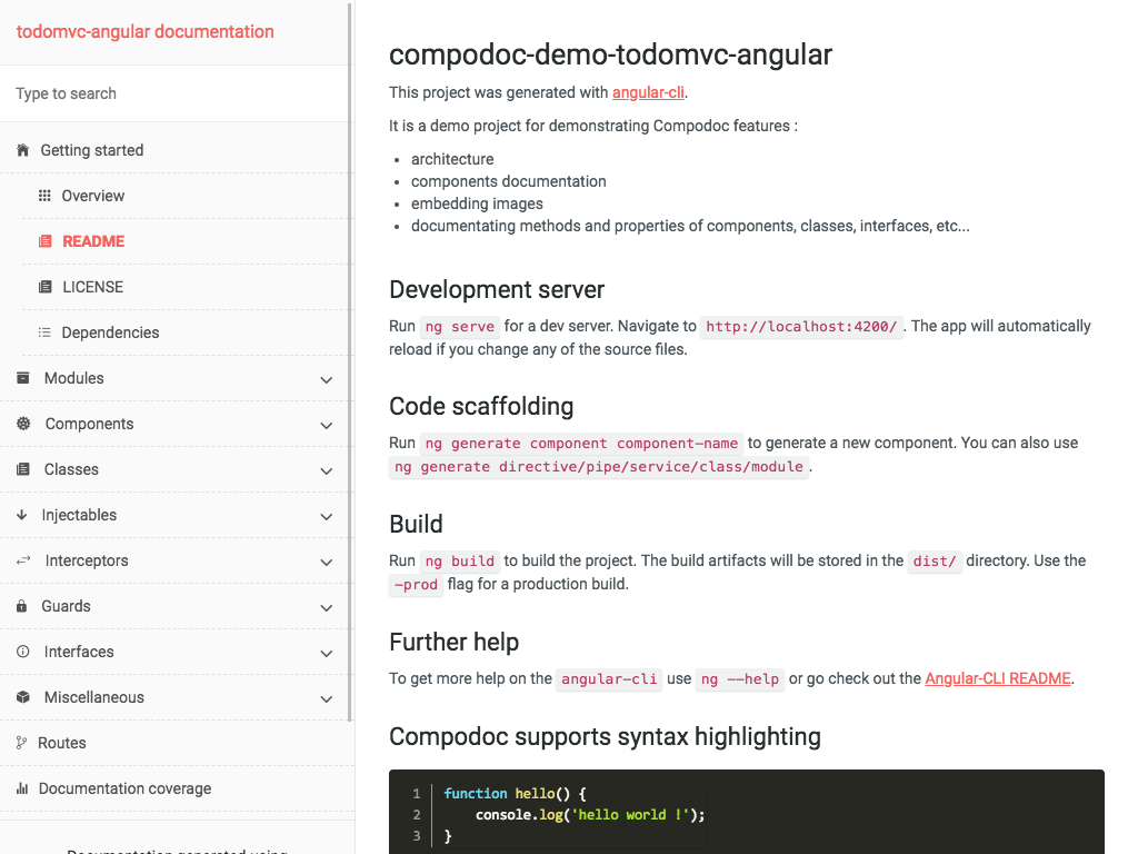
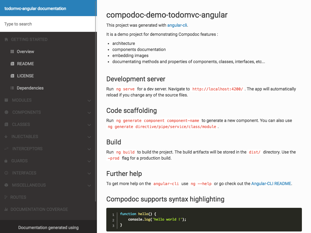
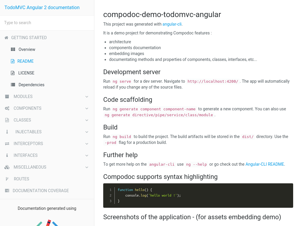
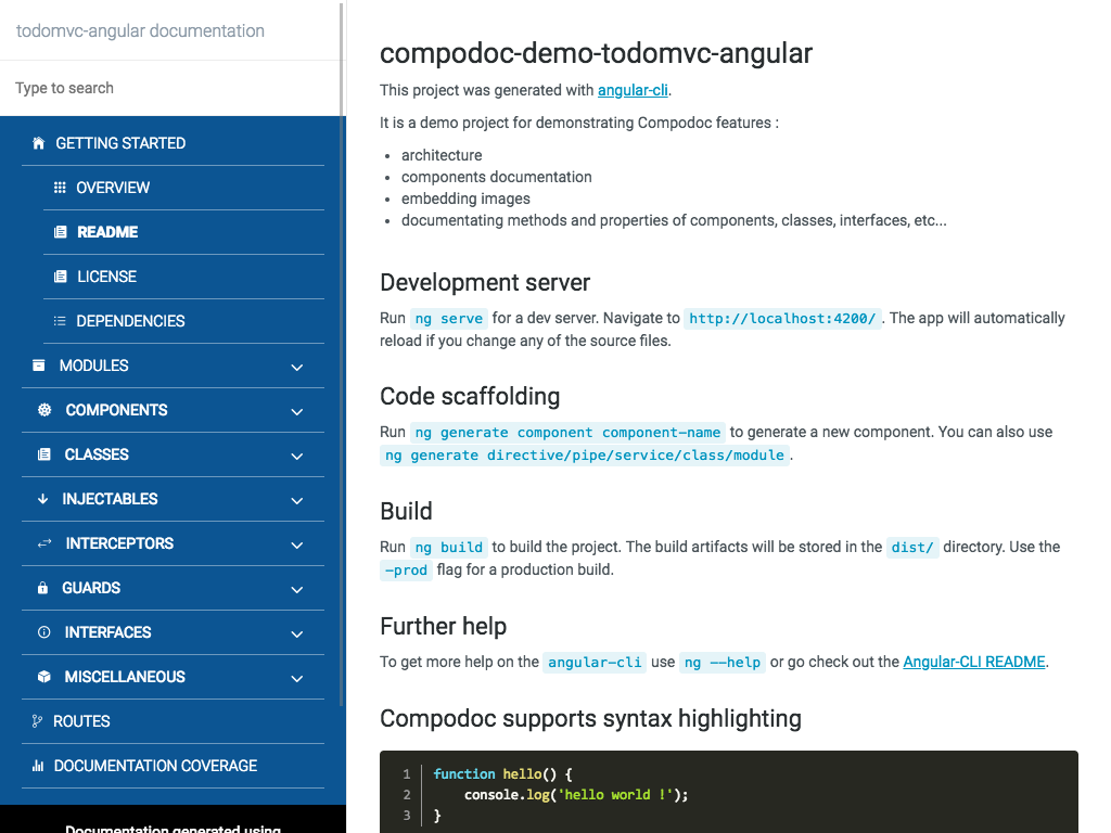
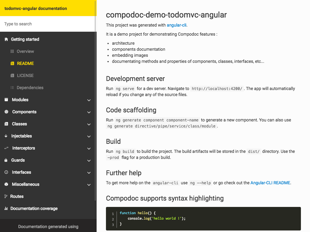
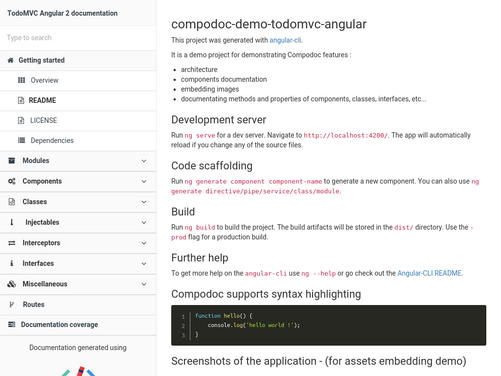
Beautiful themes — 7 themes are available from famous documentation tools like Gitbook, Read the Docs or projects like Vagrant, Laravel, Postmark and Stripe.
-
Search — Compodoc include a powerful search engine (lunr.js) for easily finding your information
-
Automatic table of contents - API table of contents is generated using elements found during files parsing
-
Open-source and on npm - Use it directly in your project using npm and one script, that's it !
-
A local tool - No server needed, no sources uploaded online
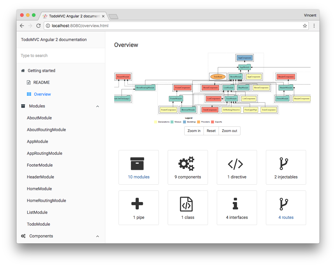
Demo : documentation generated for TodoMVC Angular Compodoc demo
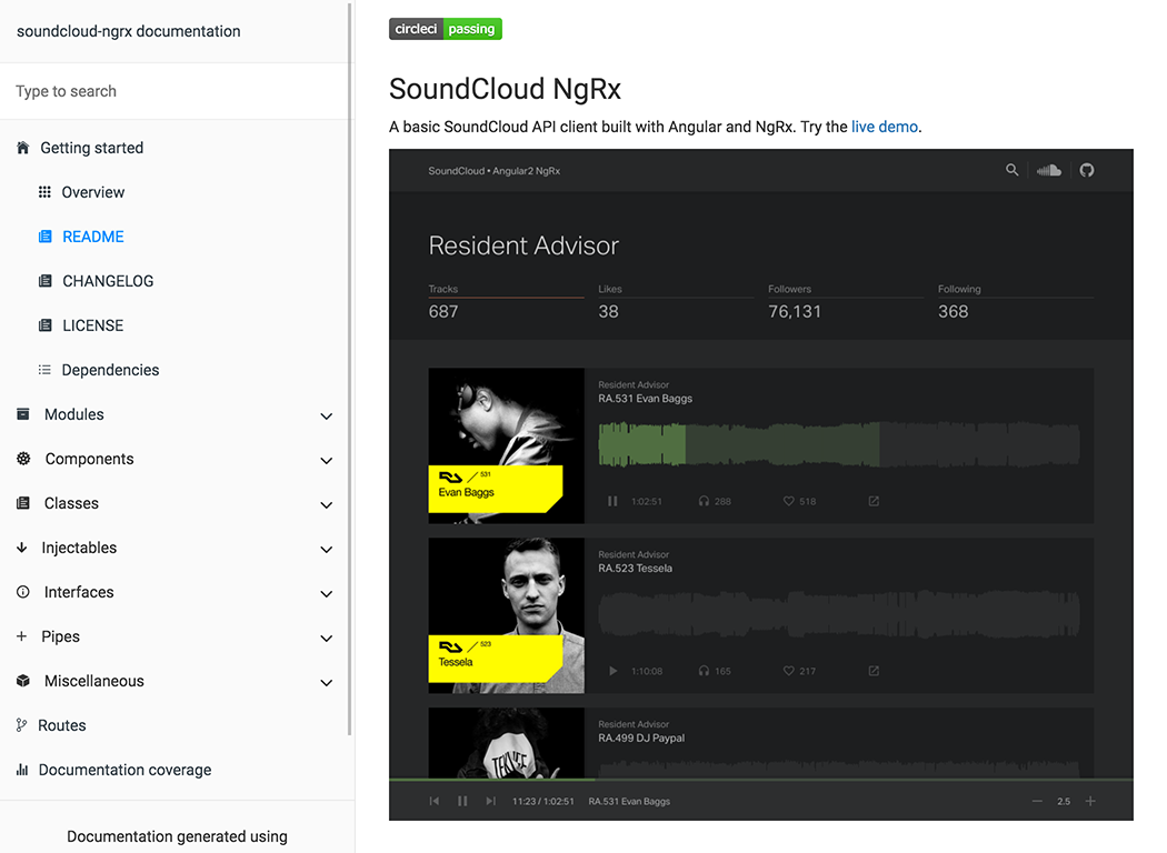
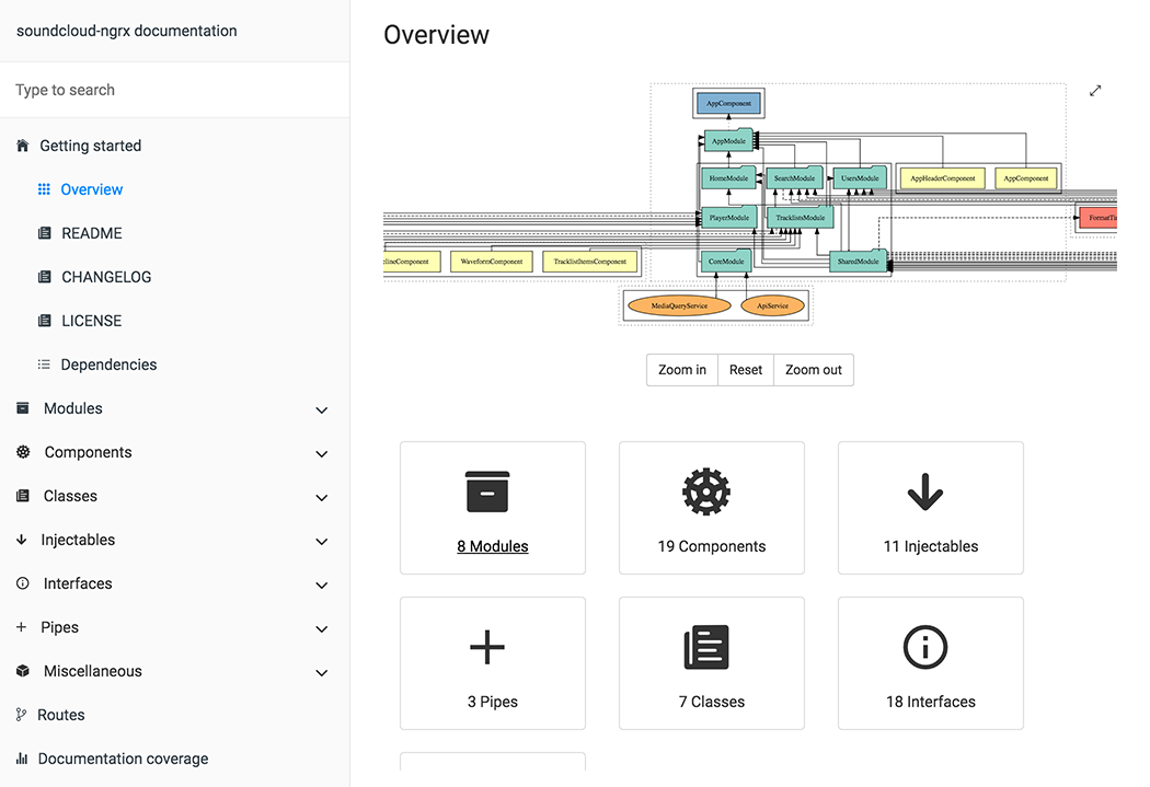
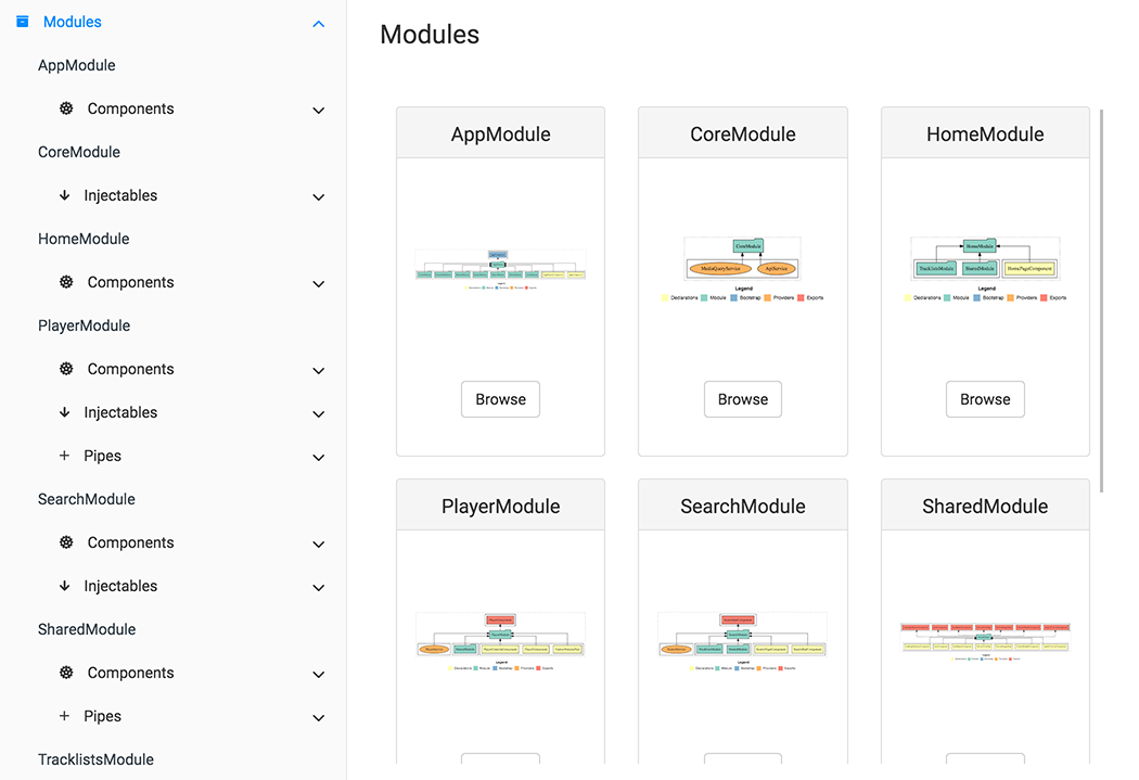
Using SoundCloud API client / Angular2 project and default theme (gitbook)
| README page | Overview page |
|---|---|
 |
 |
| Modules page | Single module page |
 |
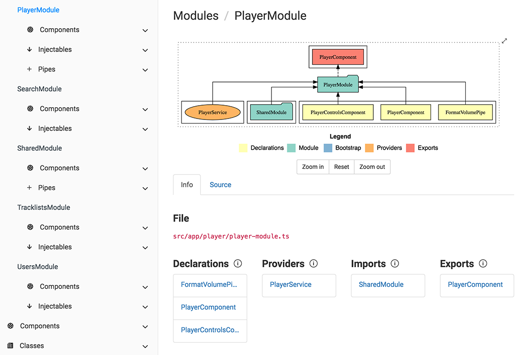 |
| Component page | Source code tab |
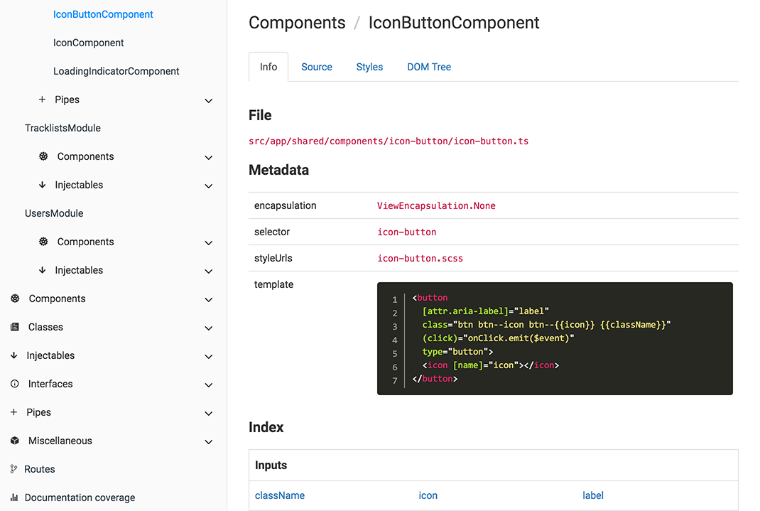 |
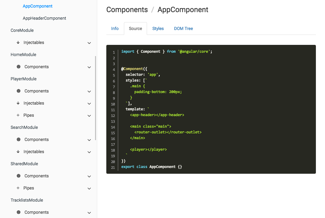 |
| Search page | |
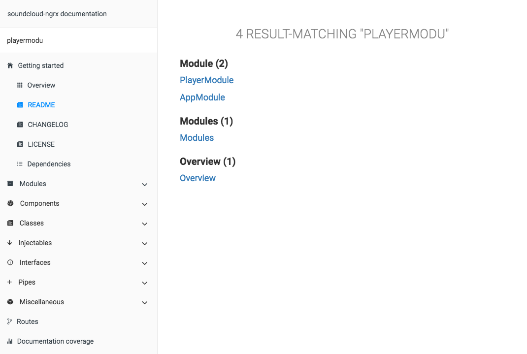 |
Because we doesn't find our needs on existing tools. We want to have a single place where there is :
- api documentation of code
- component(s), directive(s), pipe(s), ... documentation
- general documentation (*.md files)
KISS principle or shortly "Keep it simple". We think static html files are simpler than another SPA inside an "SPA documentation".
- Getting Started with compodoc
- Themes
- Common use cases
- Remark for comments
- Remark for routes
- Roadmap
- Extensions
- Contributing
- Contributors
- Resources
- License
Install from npm :
npm install -g compodoc
$ compodoc --help

Usage: compodoc <src> [options]

Options:

  -h, --help                output usage information
  -V, --version             output the version number
  -p, --tsconfig [config]   A tsconfig.json file
  -d, --output [folder]     Where to store the generated documentation
  -b, --base [base]         Base reference of html tag <base>
  -y, --extTheme [file]     External styling theme
  -n, --name [name]         Title documentation
  -o, --open                Open the generated documentation
  -t, --silent              In silent mode, log messages aren't logged in the console
  -s, --serve               Serve generated documentation (default http://localhost:8080/)
  -r, --port [port]         Change default serving port
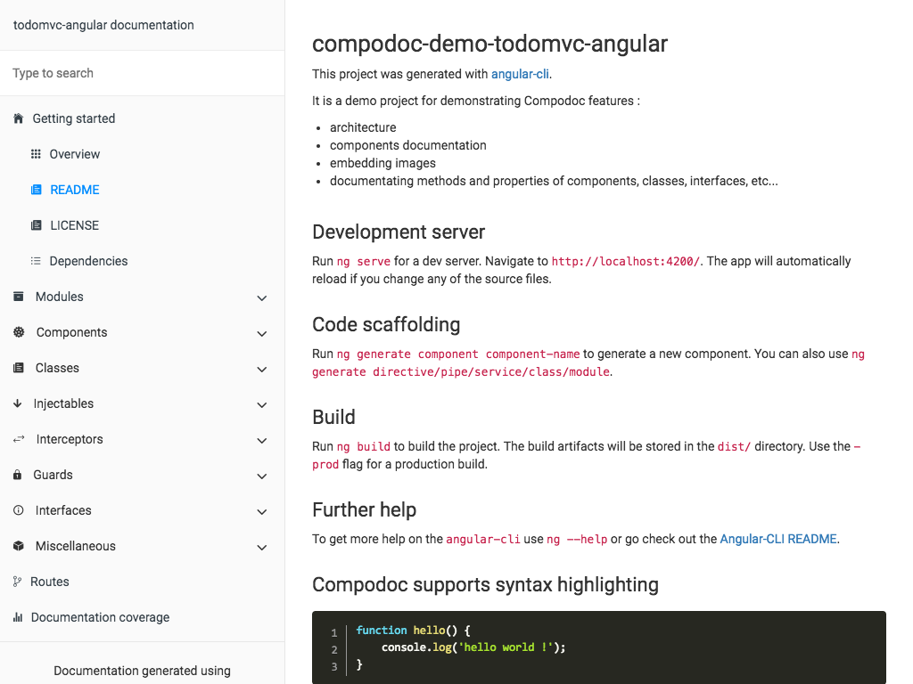
  --theme [theme]           Choose one of available themes, default is 'gitbook' (laravel, original, postmark, readthedocs, stripe, vagrant)
  --hideGenerator           Do not print the Compodoc link at the bottom of the page
  --disableSourceCode       Do not add source code tab
  --disableGraph            Disable rendering of the dependency graph
npm install --save-dev compodoc
Define a script task for it in your package.json :
"scripts": {
  "compodoc": "./node_modules/.bin/compodoc -p src/tsconfig.json"
}
and run it like a normal npm script :
npm run compodoc
| Default (gitbook) | Laravel |
|---|---|
 |
 |
| Readthedocs | Stripe |
 |
 |
| Vagrant | Postmark |
 |
 |
| Original | |
 |
Documentation is generated in default output folder, then run your HTTP server in that folder.
compodoc -p src/tsconfig.json
compodoc src -p src/tsconfig.json
Documentation was generated in default output folder or a specific one, the local HTTP server is launched at http://localhost:8080
compodoc -s

or

compodoc -s -d ./doc
Documentation is generated in default output folder, and a local HTTP server is available at http://localhost:8080
compodoc -p src/tsconfig.json -s
compodoc -p src/tsconfig.json -y your_theme_styles/
Inside your folder you need to provide at least a style.css file with these 5 imports as below.
@import "./reset.css";
@import "./bootstrap.min.css";
@import "./bootstrap-card.css";
@import "./font-awesome.min.css";
@import "./compodoc.css";
Compodoc use bootstrap 3.3.7. You can customize Compodoc easily.
bootswatch.com can be a good starting point. If you want to override the default theme, just provide a bootstrap.min.css file, and it will override the default one.
└── your_theme_styles/
    ├── style.css // the main css file with default imports
    └── bootstrap.min.css // your bootstrap theme
A comment description in xxx.component.ts file, between JSDoc comments can be a little short.
Compodoc search for a default README.md file inside the root folder of each component, and add it inside a tab in the component page.
└── my-component/
    ├── my.component.ts
    ├── my.component.spec.ts
    ├── my.component.scss|css
    ├── my.component.html
    └── README.md
The live demo as a component documented in that way : TodoMVC Angular Compodoc demo / todo component
Compodoc use Typescript AST parser and it's internal APIs, so the comments have to be JSDoc comments :
/**
 * Supported comment
 */
These ones are not supported :
/*
 * unsupported comment
 */

/*
  unsupported comment
 */

// unsupported comment
Follow the style guide and provide a const of type 'Routes' :
const APP_ROUTES: Routes = [
    { path: 'about', component: AboutComponent },
    { path: '', component: HomeComponent}
];

...

RouterModule.forRoot(APP_ROUTES)
Compodoc use Marked for markdown parsing and compiling to html. highlight.js has been added for supporting syntax highlighting.
Just use a normal code block in your markdown with correct language : Github help
The integrated languages are : json, bash, javascript, markdown, html, typescript
- handle external markdown files as "functional" documentation
- watch/recompile feature while serving documentation
- support for Angular 1.5+ projects written in Typescript
- routes
- classes
- module(s) page(s) with comments
- component(s) page(s) with comments, API, class
- directives
- injectables
- interfaces
- pipes
There is a plugin available to run Compodoc with Gulp. You can find it on NPM:
https://www.npmjs.com/package/gulp-compodoc
There is a JHipster module available to run Compodoc with JHipster. You can find it on NPM:
https://www.npmjs.com/package/generator-jhipster-compodoc
Want to file a bug, contribute some code, or improve documentation? Excellent! Read up on our guidelines for contributing.
|
|
:---: |:---: |:---: |:---: |:---: |:---: |
vogloblinsky |daniele-zurico|
Inspired by stuff from angular2-dependencies-graph, ng-bootstrap
Logo designed using Book vector designed by Freepik
Everything in this repo is MIT License unless otherwise specified.
MIT © 2016 - Vincent Ogloblinsky

