Using CocoaPods
Edit your Podfile and specify the dependency:
pod 'MLCardDrawer'Using Swift Package Manager
Add MLCardDrawer as a dependency. Adding the following line in dependenciesvalue of your Package.swift.
  dependencies: [
    .package(url: "https://github.com/mercadolibre/meli-card-drawer-ios.git", from: "1.0")
]- Easy to integrate
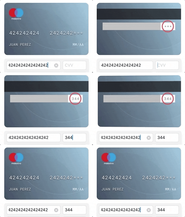
- Card number, name, expiration date and CVV support (CardData protocol)
- Card left and right image customization (CardUI protocol)
- CVV support at front & back view
- Card flip animation integrated
- Shine card effect with MotionEffect 🔥🔥
- Live card view updated while CardData protocol is edited
- PCI compliance (We do not save anything)
- Support for custom overlay background image
- Support for custom gradient
- Support remote images (optional)
import MLCardDrawer// You can create your containerView by code or by storyboard/xib (as you like)
private var containerView: UIView = UIView()
private var cardDrawer: MLCardDrawerController?cardDrawer = MLCardDrawerController(cardUIHandler, cardDataHandler)cardDrawer?.setUp(inView: containerView).show()// You can highlight the security code location.
// If the security code is behind, the card will transition with flip animation.
cardDrawer?.showSecurityCode()cardDrawer?.show()cardDrawer?.setShineCard(enabled: true)You can customize the data structure and style of your card.
Using CardData protocol to update the card display values.
@objc public protocol CardData {
    var name: String { get set }
    var number: String { get set }
    var expiration: String { get set }
    var securityCode: String { get set }
    @objc optional var lastDigits: String { get set}
}Using CardUI protocol to customize: position of security code, card background, font color, place holders, etc.
@objc public protocol CardUI {
    var cardPattern: [Int] { get }
    var placeholderName: String { get }
    var placeholderExpiration: String { get }
    var cardFontColor: UIColor { get }
    var cardBackgroundColor: UIColor { get }
    var securityCodeLocation: MLCardSecurityCodeLocation { get }
    var defaultUI: Bool { get }
    var securityCodePattern: Int { get }

    @objc optional func set(bank: UIImageView)
    @objc optional func set(logo: UIImageView)
    @objc optional var fontType: String { get }
    @objc optional var bankImage: UIImage? { get }
    @objc optional var cardLogoImage: UIImage? { get }
    @objc optional var ownOverlayImage: UIImage? { get }
}Using addTagBottom protocol to customize: position bottom tag, background color, font color, place holders.
public protocol CapabilitiesComponentsViewProtocol: NSObject {
    func addTagBottom(containerView: UIView, isDisabled: Bool, cardType: MLCardDrawerTypeV3, tagBottom: Text?, padding: UIEdgeInsets)
}
- Bitrise for releases
- Codebeat integration
- Shine card effect with MotionEffect 🔥🔥
- SwiftLint
- Migration to Swift 5
- Native support to display card in disabled mode (card disabled)
- Version 2.0 SwiftUI compatible 😈
- Create a bottom tag capability
This project include an example project using MLCardDrawer and another target with xCTests test cases.
Enter to path: meli-card-drawer-ios/Example_MeliCardDrawer and run pod install command. After that, you can open Example_MeliCardDrawer.xcworkspace
- iOS 9.0+
- Swift 4.2
- xCode 9.2+
- @Objc full compatibility
This is an open source project, so feel free to contribute. How? -> Fork this project and propose your own fixes, suggestions and open a pull request with the changes.
Juan Sanzone / @juansanzone
Copyright 2019 Mercadolibre Developers

Licensed under the Apache License, Version 2.0 (the "License");
you may not use this file except in compliance with the License.
You may obtain a copy of the License at

    http://www.apache.org/licenses/LICENSE-2.0

Unless required by applicable law or agreed to in writing, software
distributed under the License is distributed on an "AS IS" BASIS,
WITHOUT WARRANTIES OR CONDITIONS OF ANY KIND, either express or implied.
See the License for the specific language governing permissions and
limitations under the License.


