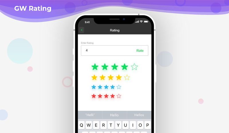
| description |
|---|
GF Flutter Rating Widget is a row of star icons, one can touch or drag the row of icons to set the rating. It has many custom properties to customize like Color,Icon. |
Flutter rating allows the user to start rating any of the products using the start icons as rating icons.
GF Flutter Star Rating is a very simple widget that permits the users to rate with the help of star icons. Users can touch the icons to start rating.
The simple code of a basic GF Start Rating is as shown below.
double _rating = 3;

GFRating(
  value: _rating,
  onChanged: (value) {
    setState(() {
      _rating = value;
    });
  },
),If showTextForm true, it displays the GF Rating bar with a text field, that takes user input to show the rating.
The simple example code of the rating bar with textform is shown below.
final _ratingController = TextEditingController();
double _userRating = 4.5;

@override
void initState() {
  super.initState();
  _ratingController.text = '4.5';
}

GFRating(
  value: _userRating,
  showTextForm: true,
  controller: _ratingController,
  suffixIcon: GFButton(
    type: GFButtonType.transparent,
    onPressed: () {
      setState(() {
        _userRating = double.parse(_ratingController.text ?? '0.0');
      });
    },
    child: const Text('Rate'),
  ),
),The look and feel of the GF Rating can be customized using the GF Rating properties.
| Name | Description |
|---|---|
| itemCount | defines the total number of rating items |
| color | defines the color of items |
| borderColor | defines the border color of [halfFilledIcon] |
| size | defines the size of items. GFSize can be used for size variations like small. medium. large |
| allowHalfRating | if true, allow half rating of items. Default it will be in a true state |
| filledIcon | defines the items when filled |
| halfFilledIcon | defines the items when half-filled |
| defaultIcon | defines the default items, when having filledIcon and halfFilledIcon |
| spacing | defines the space between items |
| value | defines the rating value |
| onChanged | return current rating whenever rating is updated |
| showTextForm | if true, shows rating [TextFormField] with the rating bar, that allows the user input to show rating |
| suffixIcon | defines the design and function of rating [TextFormField]'s suffix icon |
| controller | controls the [TextField] Controller of rating [TextFormField] |
| inputDecorations | defines the [InputDecoration] of rating [TextFormField] |
| margin | defines the margin of rating [TextFormField] |
| padding | defines the padding of rating [TextFormField] |

