You signed in with another tab or window. Reload to refresh your session.You signed out in another tab or window. Reload to refresh your session.You switched accounts on another tab or window. Reload to refresh your session.Dismiss alert
👍 Nice work. The point of this homework was to explore a simple example of a full MVC application with a RESTful API. You learned about UITableViews, custom UITableViewCells, navigation from a UITableView, and basic networking.
Grading Summary:
Functionality: Good
Code Style: Excellent
Visual Design:Good
Usability: Good
Overall: Good
Detailed Notes
Great clean code. Good job utilizing the best parts from the style guide:
In future homework, we will cover how to implement models that can deserialize from an NSDictionary. SwiftyJSON is a useful project for making it easier to deserialize the JSON response. For a more robust solution, you can also investigate using an ORM like Pistachio.
Your custom Movie cell should have a property called movie. In the custom setter of movie, you should configure the various labels and images. This decouples your custom cells from the table view controllers.
Nice work loading the images asynchronously.
Nice work setting up the proper modes for the images so that they are not stretched.
Your error message should be displayed if a network request fails and hidden again if it succeeds. You did implement this feature but it doesn't appear when connection fails.
Nice job implementing a UIScrollView. UIScrollView is the parent class of UITableView.
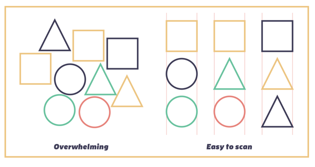
Keep alignment in mind when designing a mobile app. Alignment makes a design more neat and organized so that it's easier to read or use. This means that readers will find what they want without frustration For more information about grid theory, you can read the article here.
To use alignment properly, imagine there are evenly-spaced vertical lines running through the entire length of the design. Both the left and right edges of every single item should fall along these lines, which designers call a grid.
You want to align as many items as possible along the same grid lines. Instead of looking at layout like the game Tetris, where the goal is to fill every available space, try to arrange elements in neat columns.
BOTH
EXTRA
I suggest you use MBProgressHUD in initial load or when refresh the view. This is simpler and more elegant rather than show a ALLoadingView. This is just a matter of UX from my opinion.
I recommend you make the progress view hide after a few seconds when connection is offline
When connection is online, I can not refresh the current view. I have to change to another view
(table -> collection and vice versa) in order to refresh the view.
If connection is offline and I tap to view Movie Detail. I got a blank view. Tips: You can check connection before let users view the detail
Great job dedicating enough time to do the homework. You learned a lot! Keep up the good work.
The text was updated successfully, but these errors were encountered:
👍 Nice work. The point of this homework was to explore a simple example of a full MVC application with a RESTful API. You learned about UITableViews, custom UITableViewCells, navigation from a UITableView, and basic networking.
Grading Summary:
Overall: Good
Detailed Notes
Great clean code. Good job utilizing the best parts from the style guide:
In future homework, we will cover how to implement models that can deserialize from an NSDictionary. SwiftyJSON is a useful project for making it easier to deserialize the JSON response. For a more robust solution, you can also investigate using an ORM like Pistachio.
Your custom Movie cell should have a property called
movie. In the custom setter ofmovie, you should configure the various labels and images. This decouples your custom cells from the table view controllers.Nice work loading the images asynchronously.
Nice work setting up the proper modes for the images so that they are not stretched.
Your error message should be displayed if a network request fails and hidden again if it succeeds. You did implement this feature but it doesn't appear when connection fails.
Nice job implementing a
UIScrollView.UIScrollViewis the parent class ofUITableView.Keep alignment in mind when designing a mobile app. Alignment makes a design more neat and organized so that it's easier to read or use. This means that readers will find what they want without frustration For more information about grid theory, you can read the article here.
BOTH

EXTRA
MBProgressHUDin initial load or when refresh the view. This is simpler and more elegant rather than show aALLoadingView. This is just a matter of UX from my opinion.(table -> collection and vice versa) in order to refresh the view.
Great job dedicating enough time to do the homework. You learned a lot! Keep up the good work.
The text was updated successfully, but these errors were encountered: