This repository has been archived by the owner on Jun 24, 2022. It is now read-only.
UI issues related to PR 2440/uni merge #2626
Labels
app:CowSwap
CowSwap app
Bug
Something isn't working
Medium
Severity indicator. It causes some undesirable behavior, but the system is still functional
wontfix
Stale issue
Related to #2536
1. 'Connect to a wallet' button's boarder has a light boarder and seems like have a different boarder radius


2. Profile page: 'Connect to a wallet' button is too wide
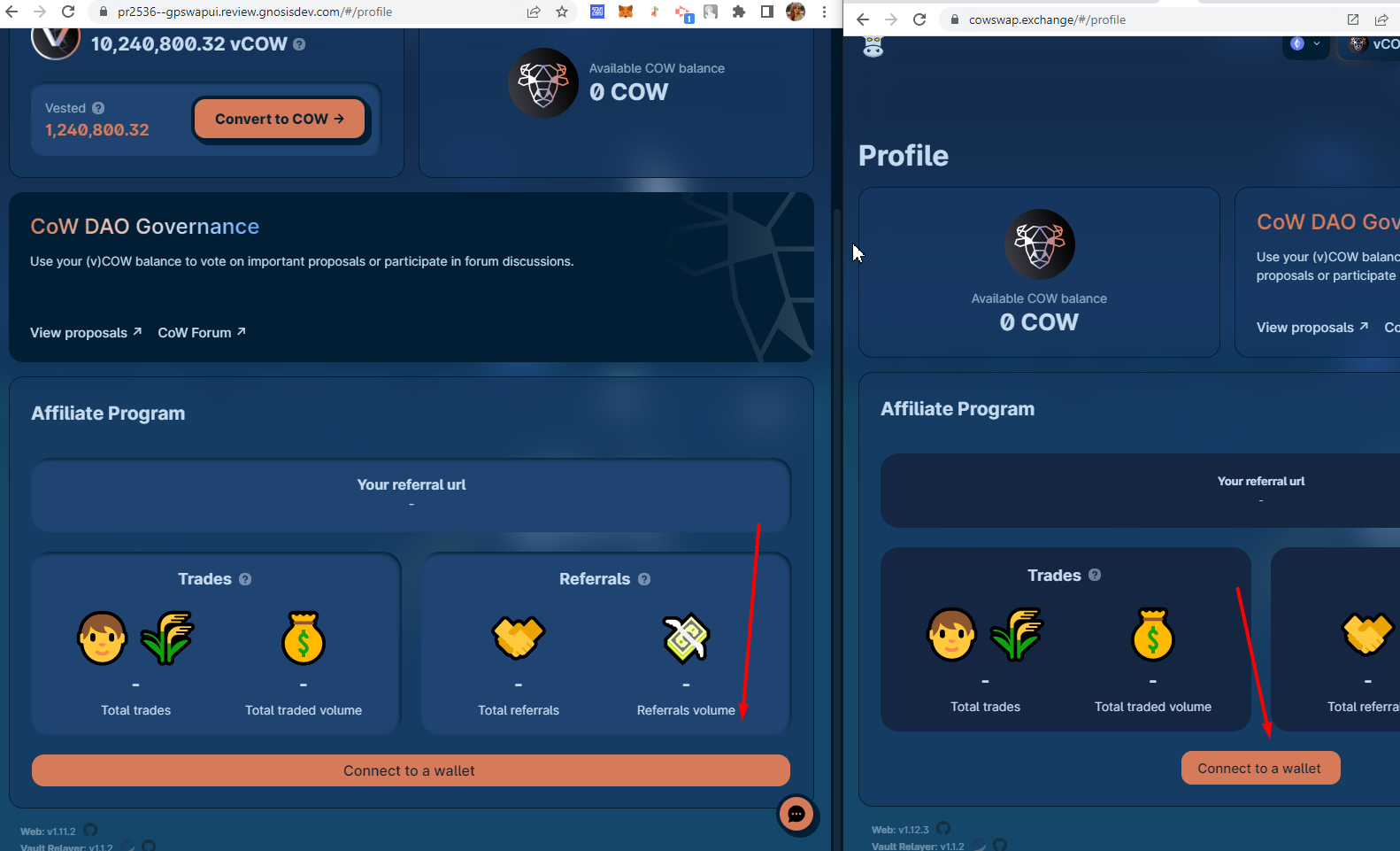
3. Text in the network selector is almost invisible in the dark mode
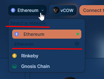
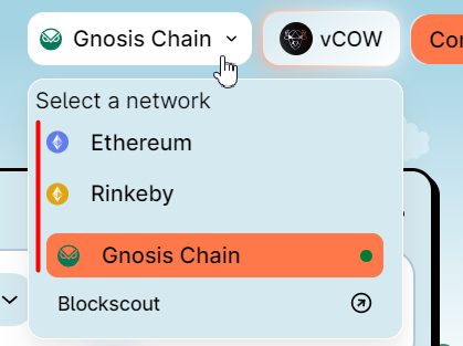
4. Networks in the selector are not aligned
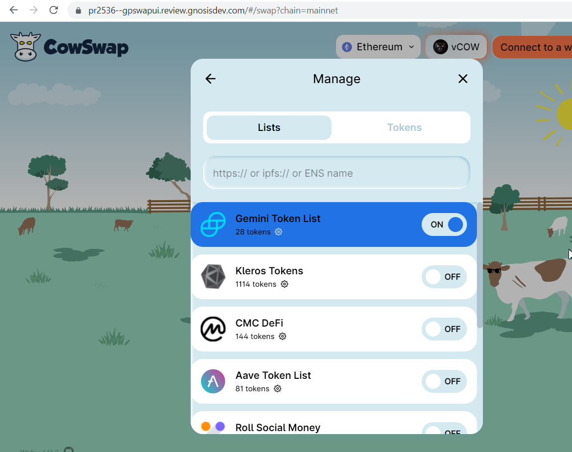
5. Token lists exceed the modal area
6. Arrow before' Add a send' field has too bold boarder + center-aligned
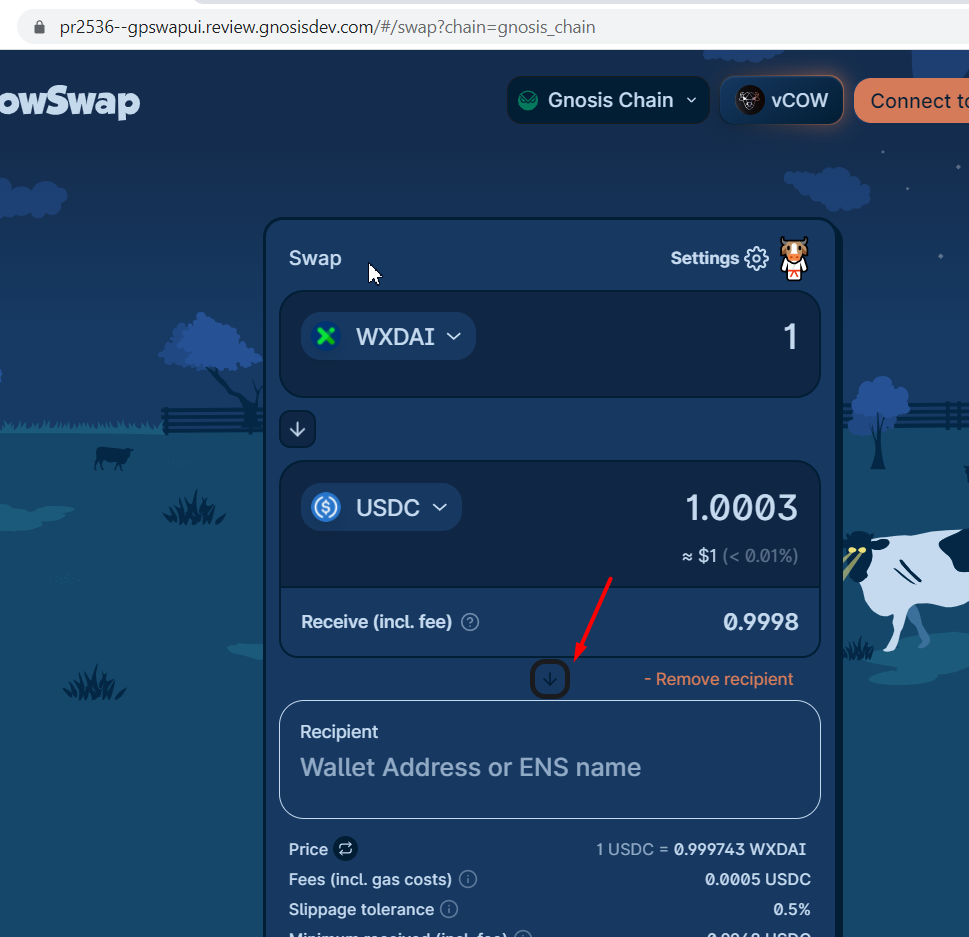
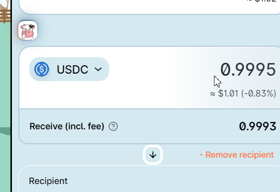
7. Naming is inconsistent: 'Add a send' and 'Remove recipient'. I think, we need to use 'recipient' for both labels (or at least 'send' for both, as it is currently on Prod)

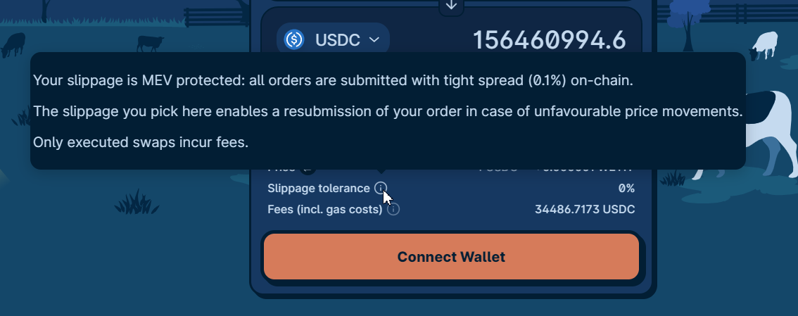
8. Too big tooltips
9. Account Icon on the 'Confirm' modal is too small


-The same is on the 'Claim' page
10. Network selector exceeds right screen boarder in mobile devices

11. Network selector is opened 'on hover' event instead of the 'on-click' as we currently use on Prod. So when I press on the network selector twice, it remains opened until I remove a mouse from it. Will we leave it as it is or change to the behavior we currently use?
12. Sometimes I can't open the network selector after a network changing in a mobile view
The text was updated successfully, but these errors were encountered: