We read every piece of feedback, and take your input very seriously.
To see all available qualifiers, see our documentation.
Have a question about this project? Sign up for a free GitHub account to open an issue and contact its maintainers and the community.
By clicking “Sign up for GitHub”, you agree to our terms of service and privacy statement. We’ll occasionally send you account related emails.
Already on GitHub? Sign in to your account
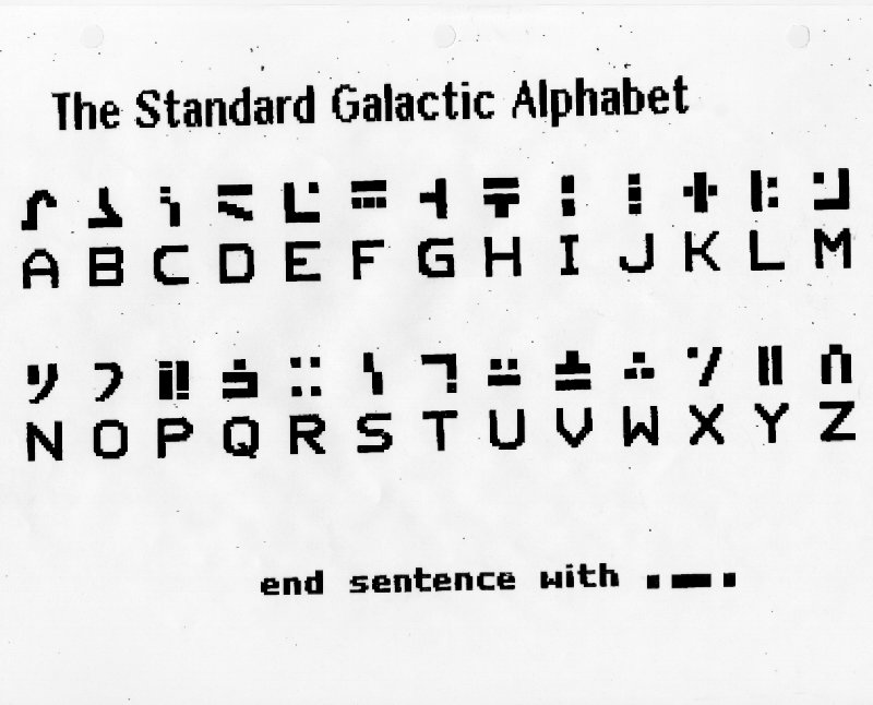
The current set of characters chosen are not true to the original Commander Keen game. Take a look at the following:
Letter A serrif is slanted
Letter B is curved instead of angular
Letter C is made of two characters and should have two dots offset above a vertical line
Letter D lines are connected and the bottom is curved
Letter E dot should be aligned to the top right edges
Letter G needs to be a bit more heavier
Letter K is close, but dots are slanted
Letter T needs a dot below it
Letter L one line is too thick
Letter M is very small and the dot is not aligned to the top right edge
Letter P is using two characters and it takes up too much width
Letter Q has fairly large curve, and it may be ideal to find an open box instead
Letter R should be as high as the other characters
Letter X is tiny
Letter Y is too skinny
Sentence ending takes up three characters and is wide
The text was updated successfully, but these errors were encountered:
No branches or pull requests
The current set of characters chosen are not true to the original Commander Keen game. Take a look at the following:

Letter A serrif is slanted
Letter B is curved instead of angular
Letter C is made of two characters and should have two dots offset above a vertical line
Letter D lines are connected and the bottom is curved
Letter E dot should be aligned to the top right edges
Letter G needs to be a bit more heavier
Letter K is close, but dots are slanted
Letter T needs a dot below it
Letter L one line is too thick
Letter M is very small and the dot is not aligned to the top right edge
Letter P is using two characters and it takes up too much width
Letter Q has fairly large curve, and it may be ideal to find an open box instead
Letter R should be as high as the other characters
Letter X is tiny
Letter Y is too skinny
Sentence ending takes up three characters and is wide
The text was updated successfully, but these errors were encountered: